
Project Summary
Speculative project for Identity Systems in the School of the Art Institute of Chicago
One of the top opera companies in the US is the Lyric Opera of Chicago. By Carol Fox, Nicola Rescigno, and Lawrence Kelly, it was established in Chicago in 1954 under the name "Lyric Theatre of Chicago," and its inaugural season featured Maria Callas's American stage debut in Norma.
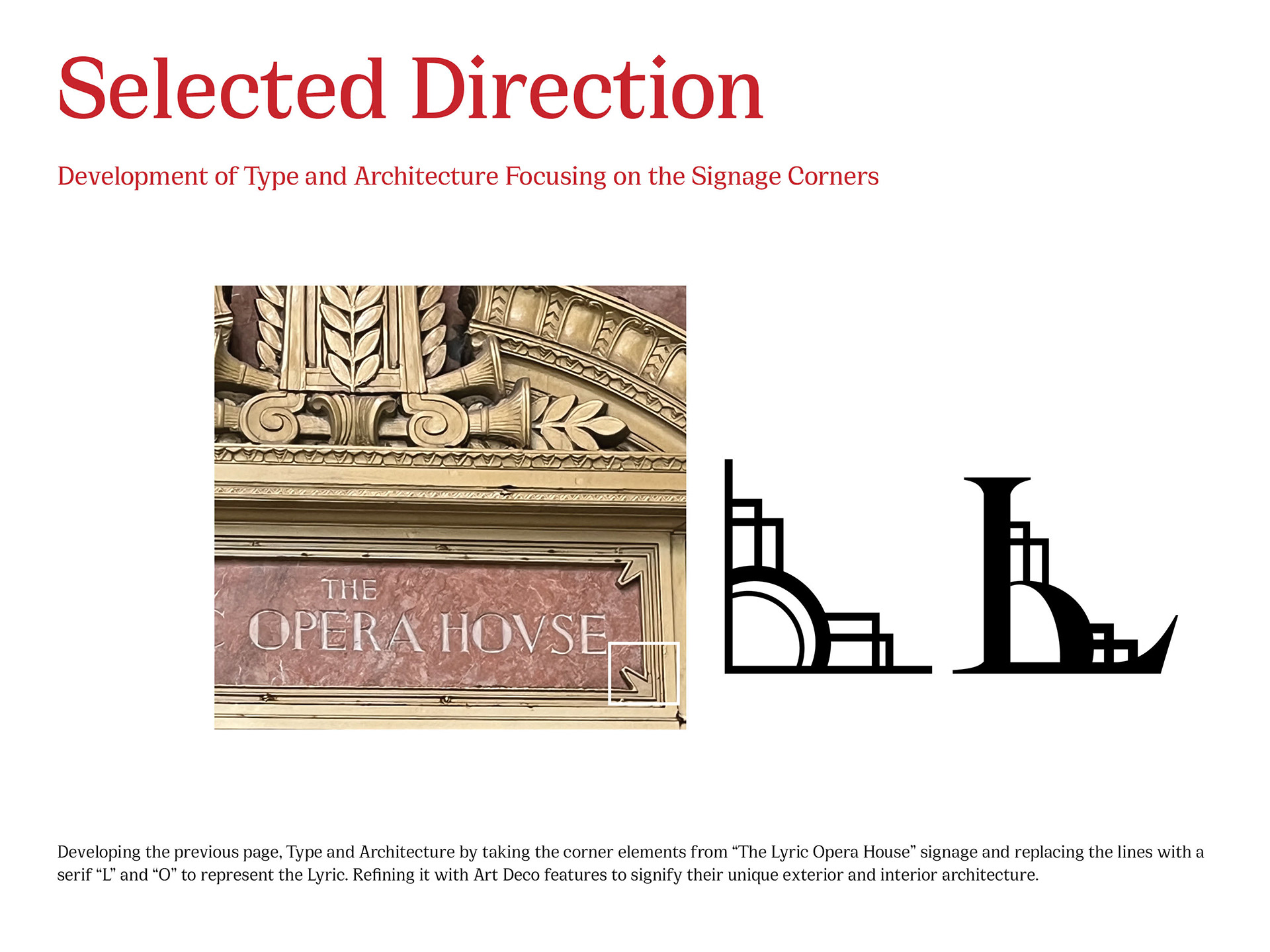
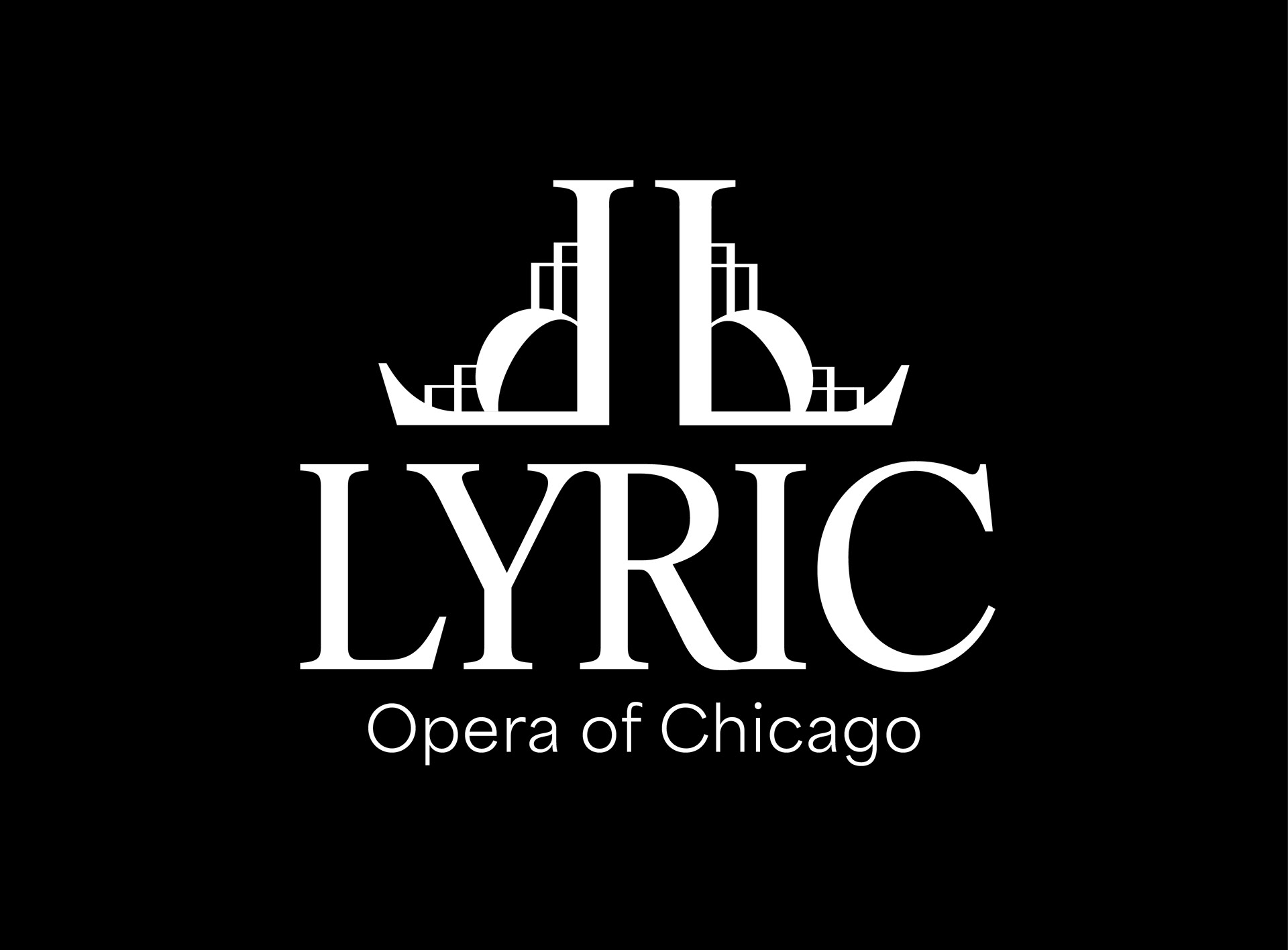
After a market analysis and in-depth research into their history, existing identity, similar organizations, and target audience, I propose the solution of redesigning a new identity that pays homage to their rich Art Deco architecture and historical presence. The new mark is derived from the corners of their signage and is reflected to simultaneously represent their stage.
The lavish color palette and unique patterns generated from the symbol allow for many collaterals, applications, and marketing materials beyond the prototypes exhibited in this presentation.
⎯⎯⎯⎯⎯
Role: Brand Strategist, Graphic Designer, Art Director
Tools: Adobe Illustrator, Photoshop, InDesign, Adobe XD, Premiere Pro, After Effects
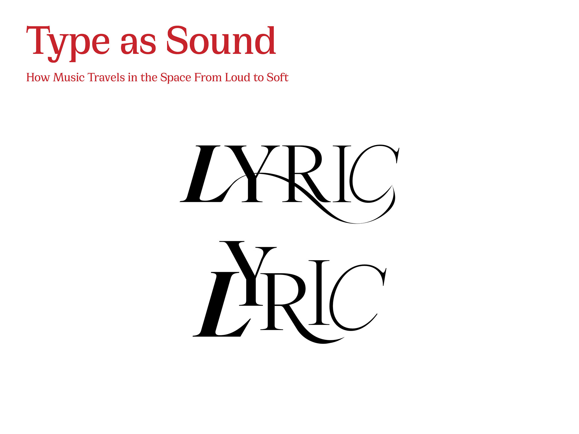
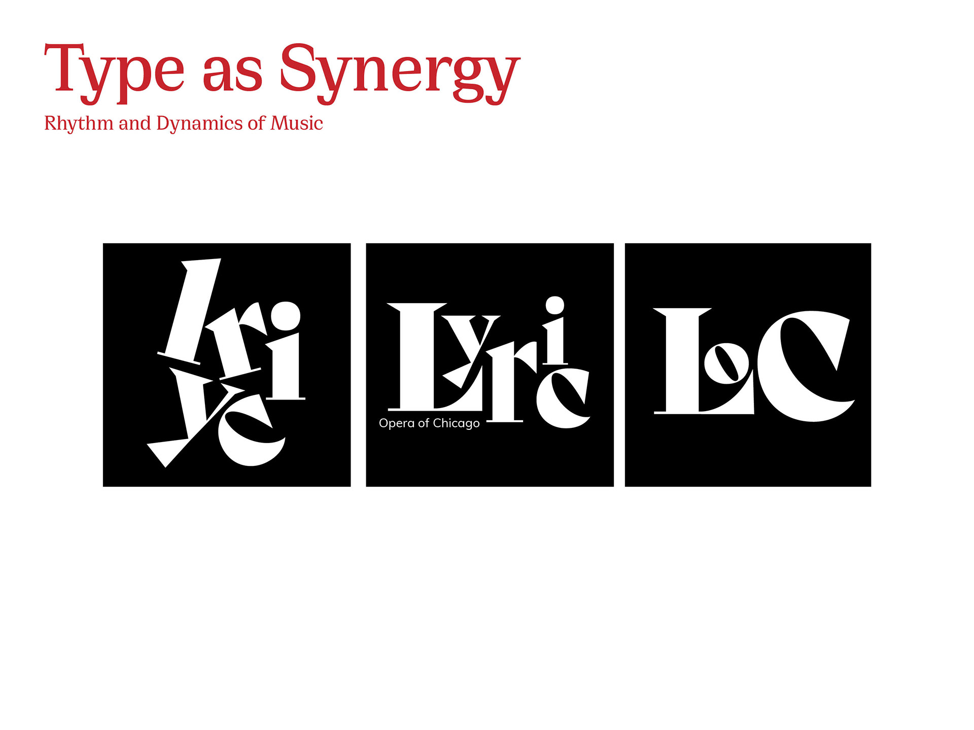
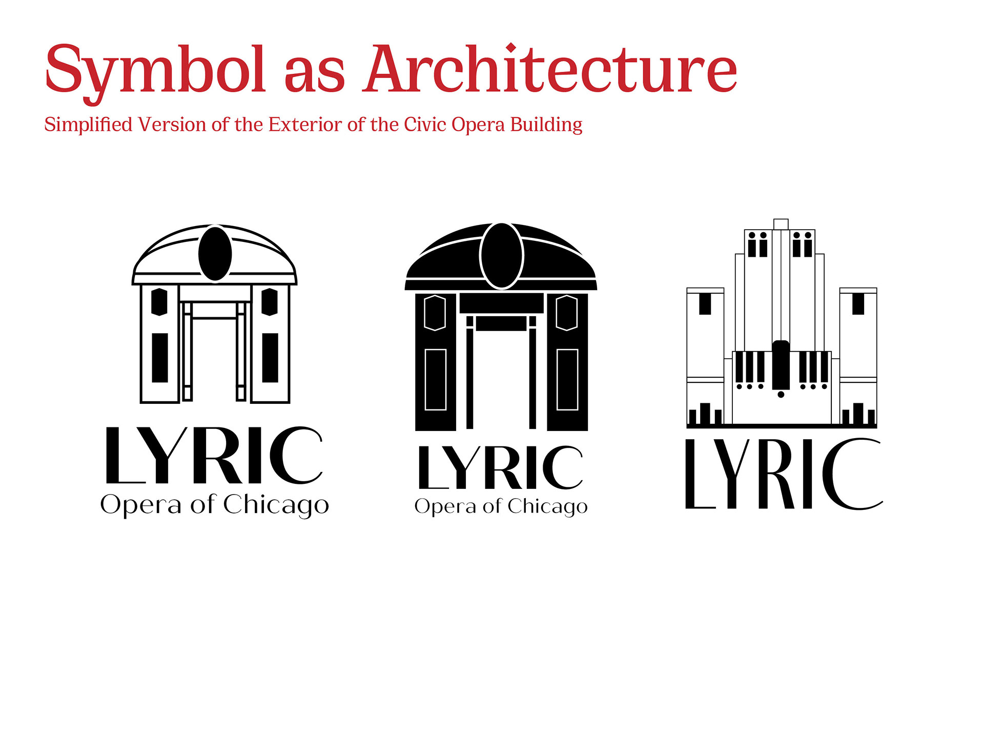
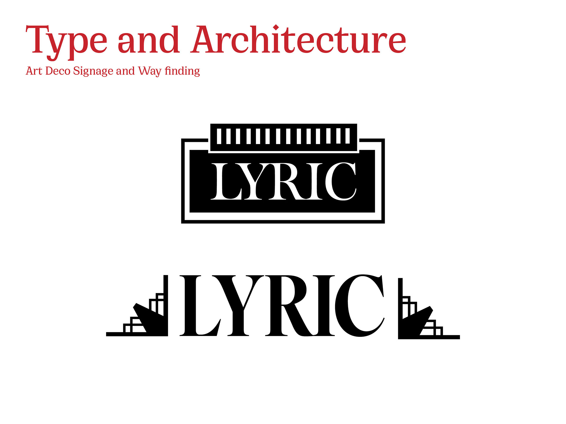
Mark Development
The following initial sketches best visualize Lyric’s main elements of stage, synergy, architecture, and sound.

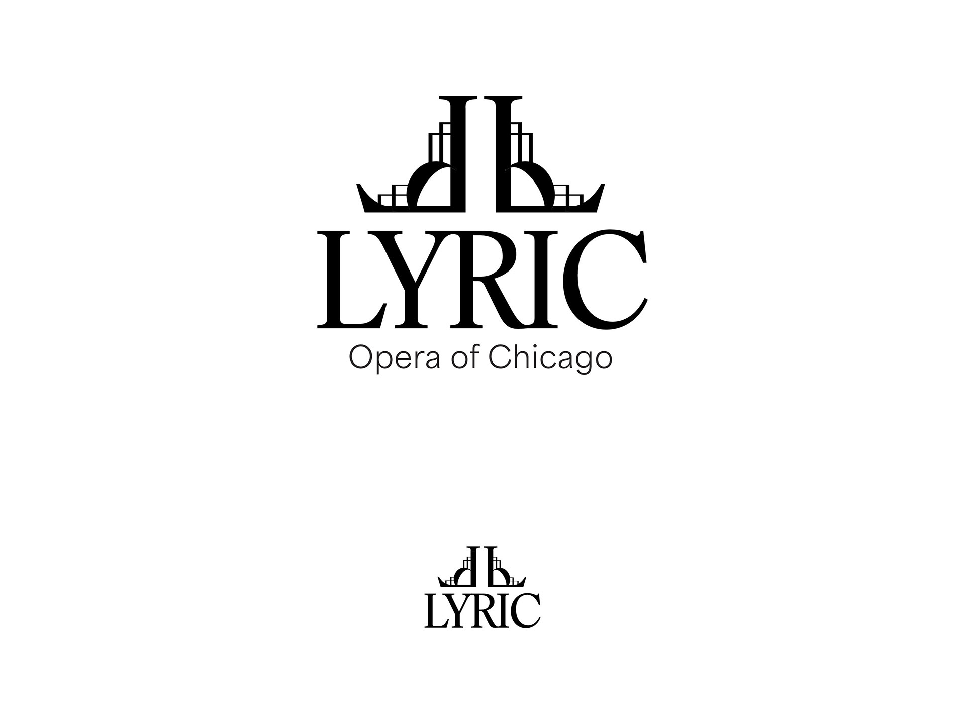
Final Mark
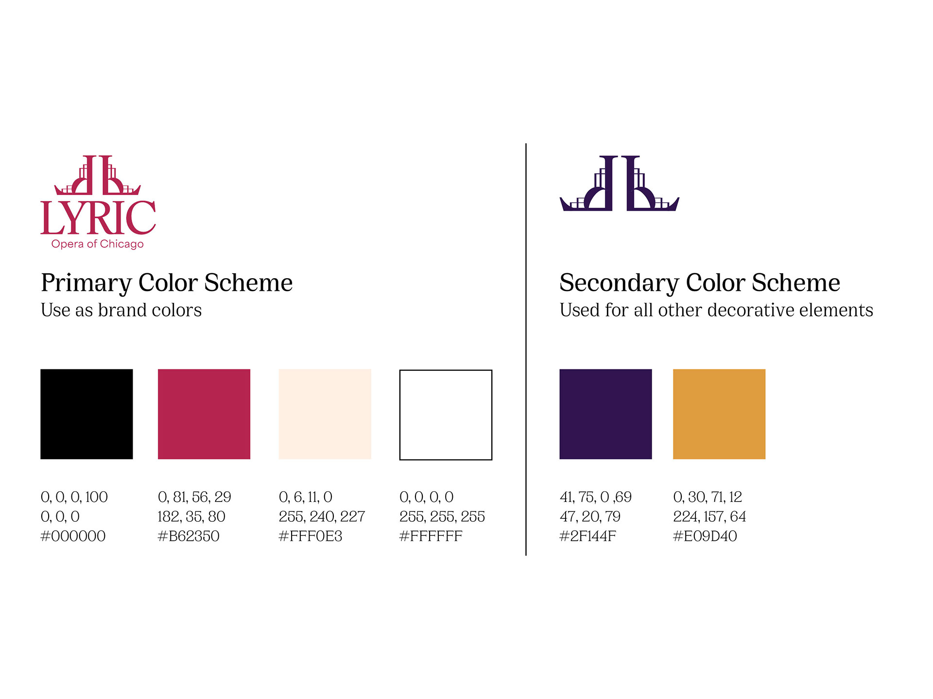
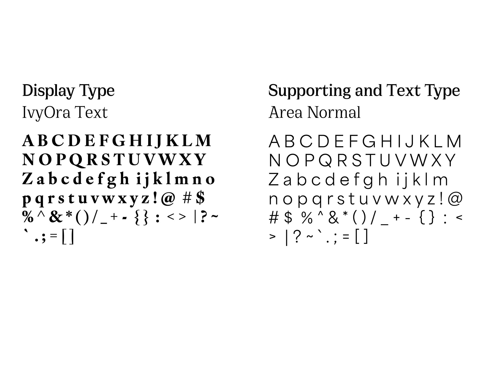
In color, scalability, color palette, and typography.


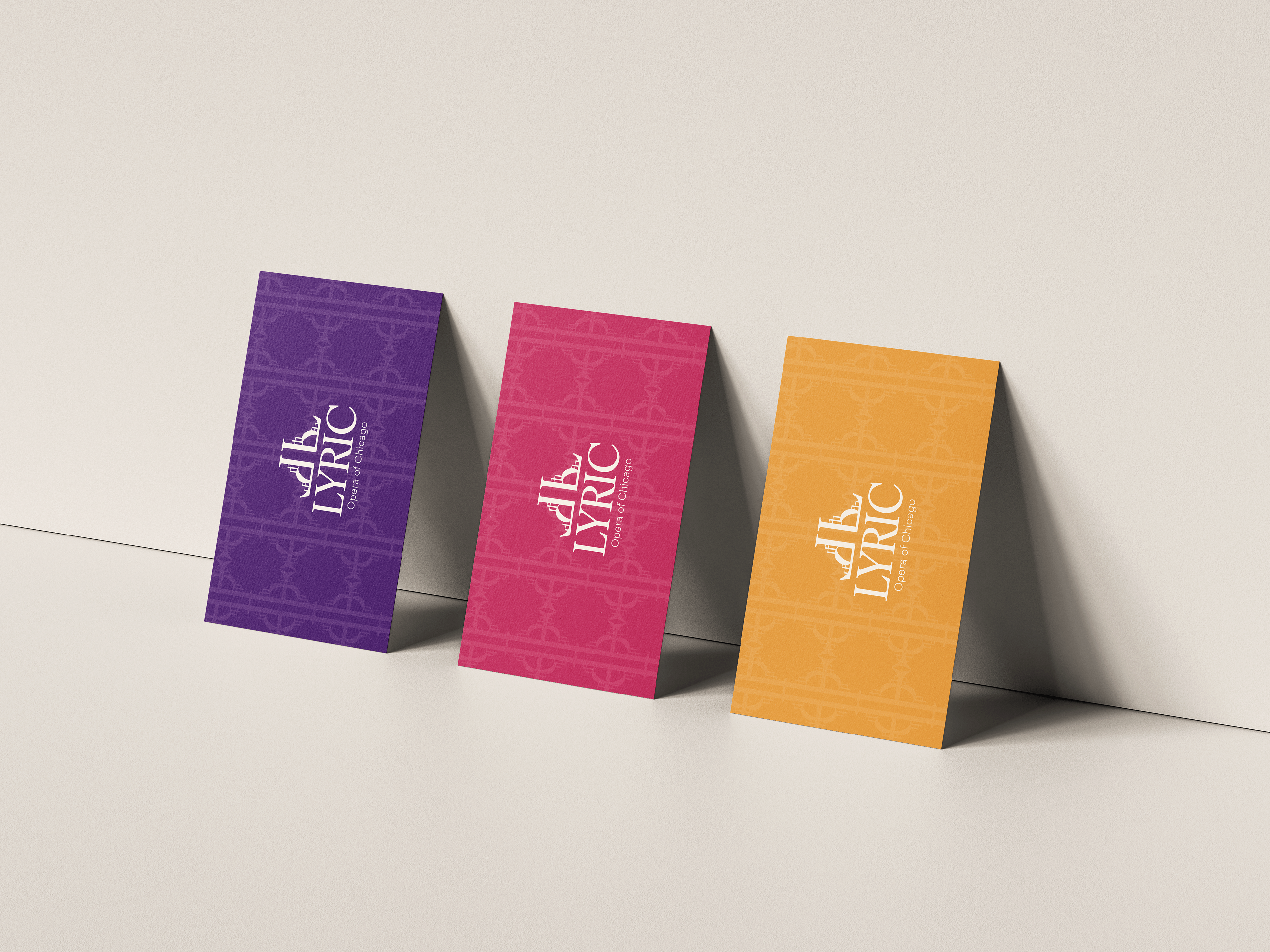
Pattern
Repeating the “L” mark in the symbol in various directions and angles to form unique patterns.
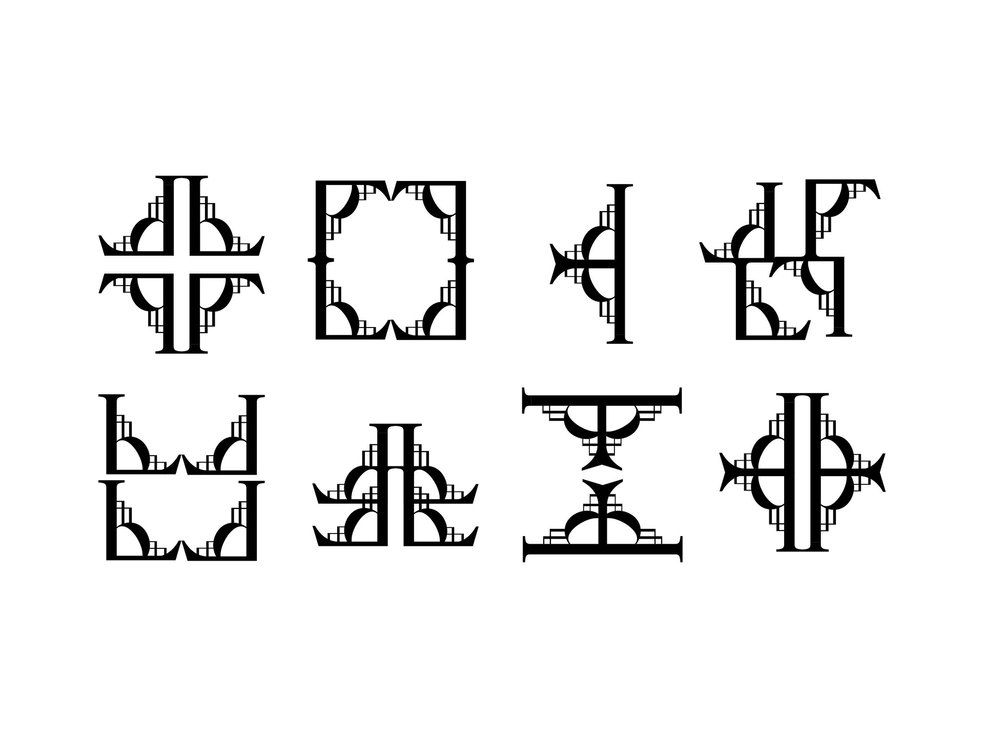

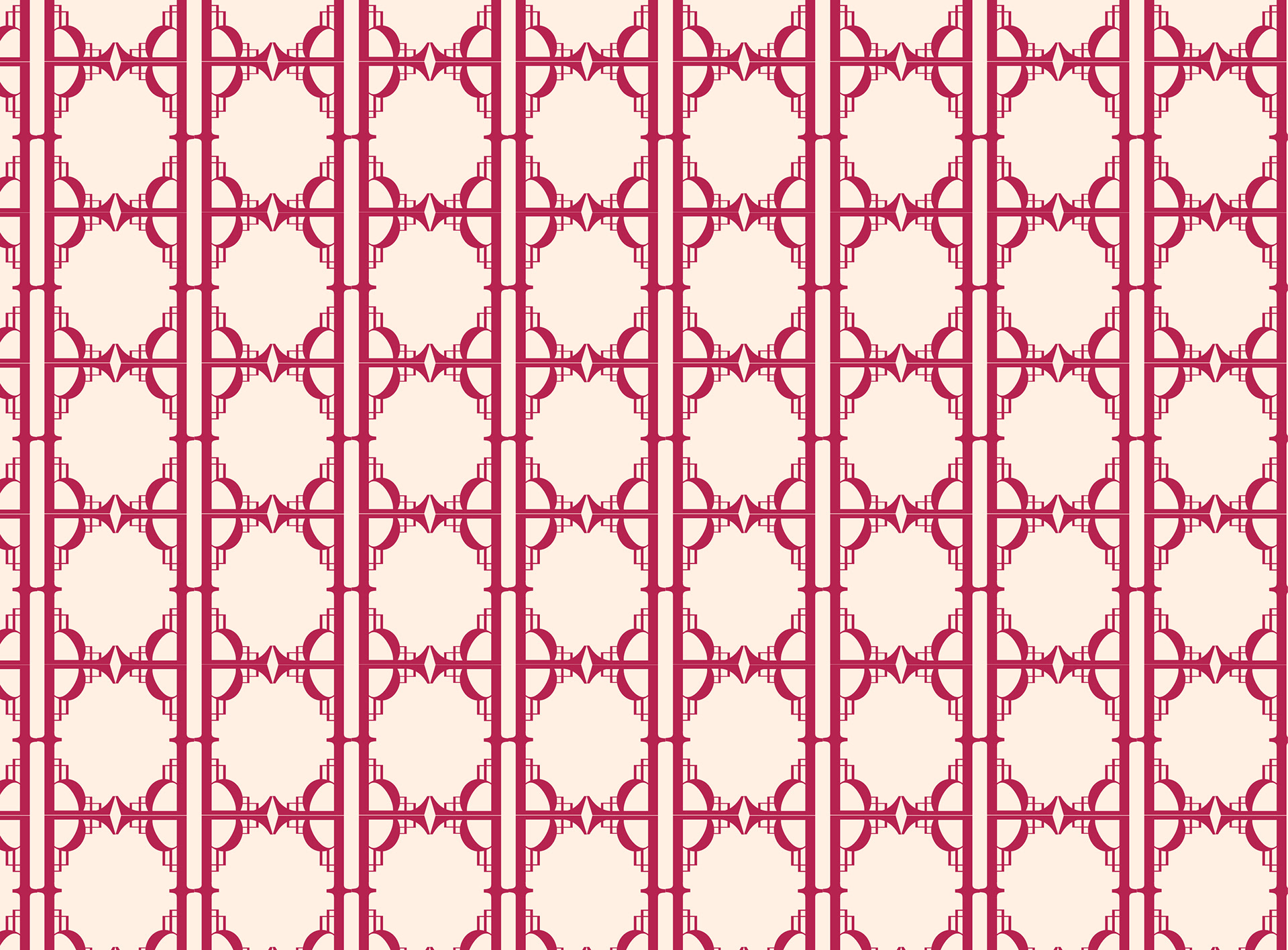

Image Treatment
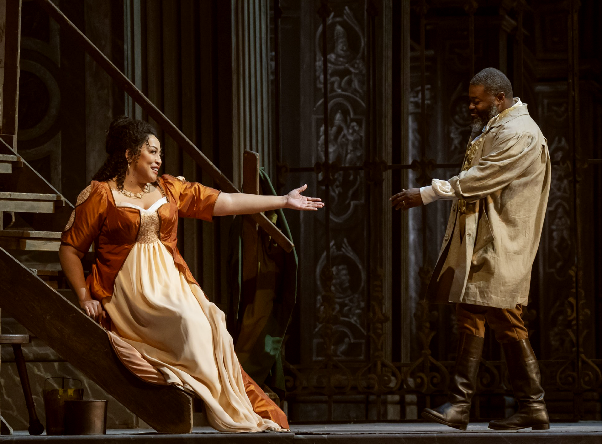
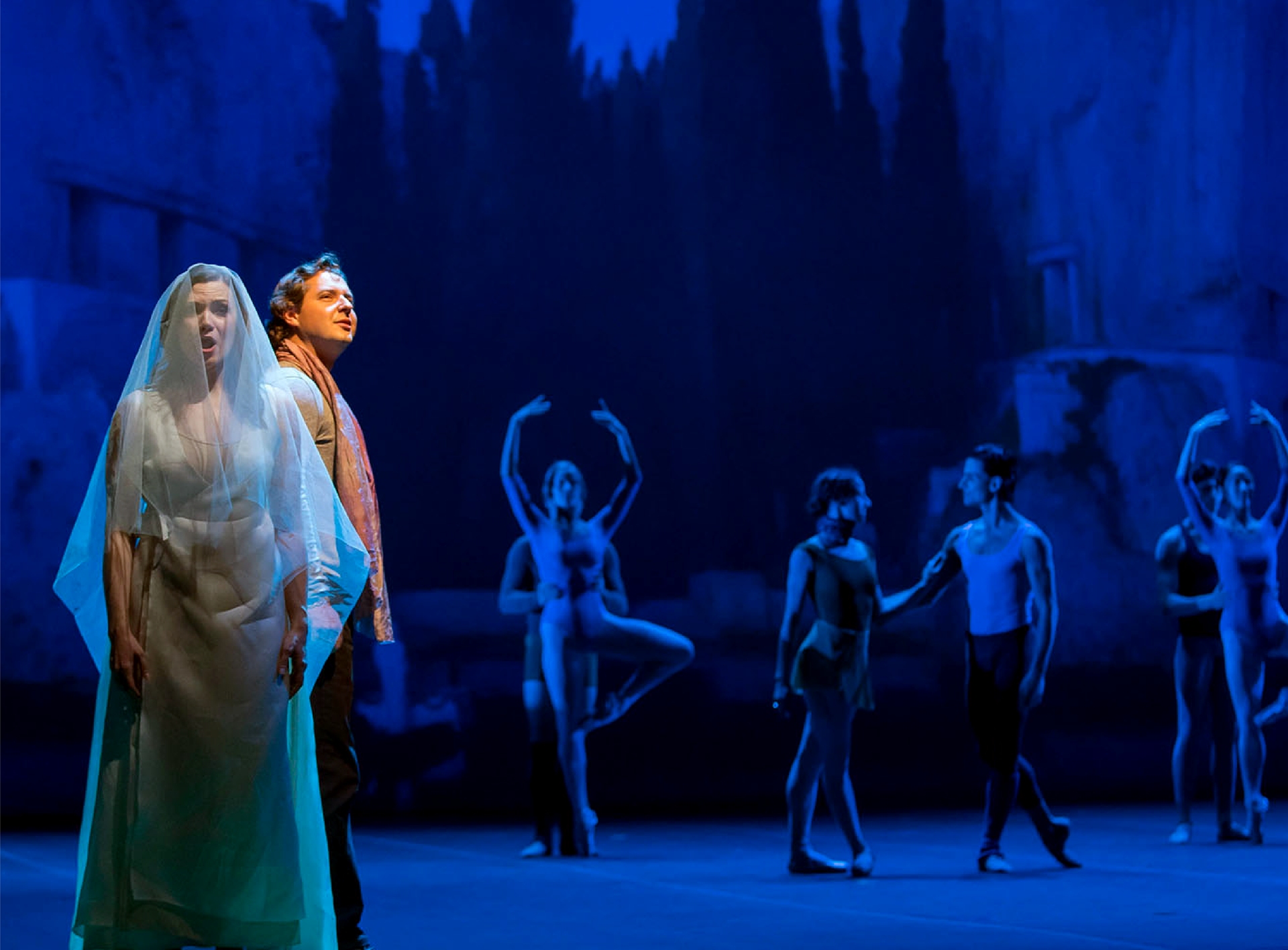
More warmth was brought into the photographs.
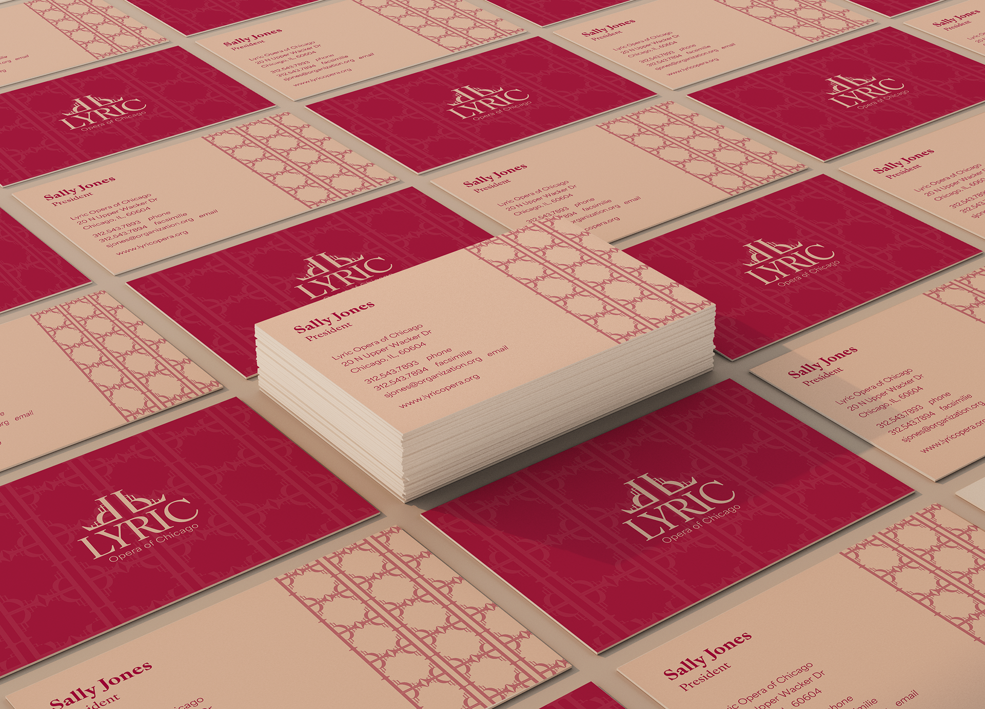
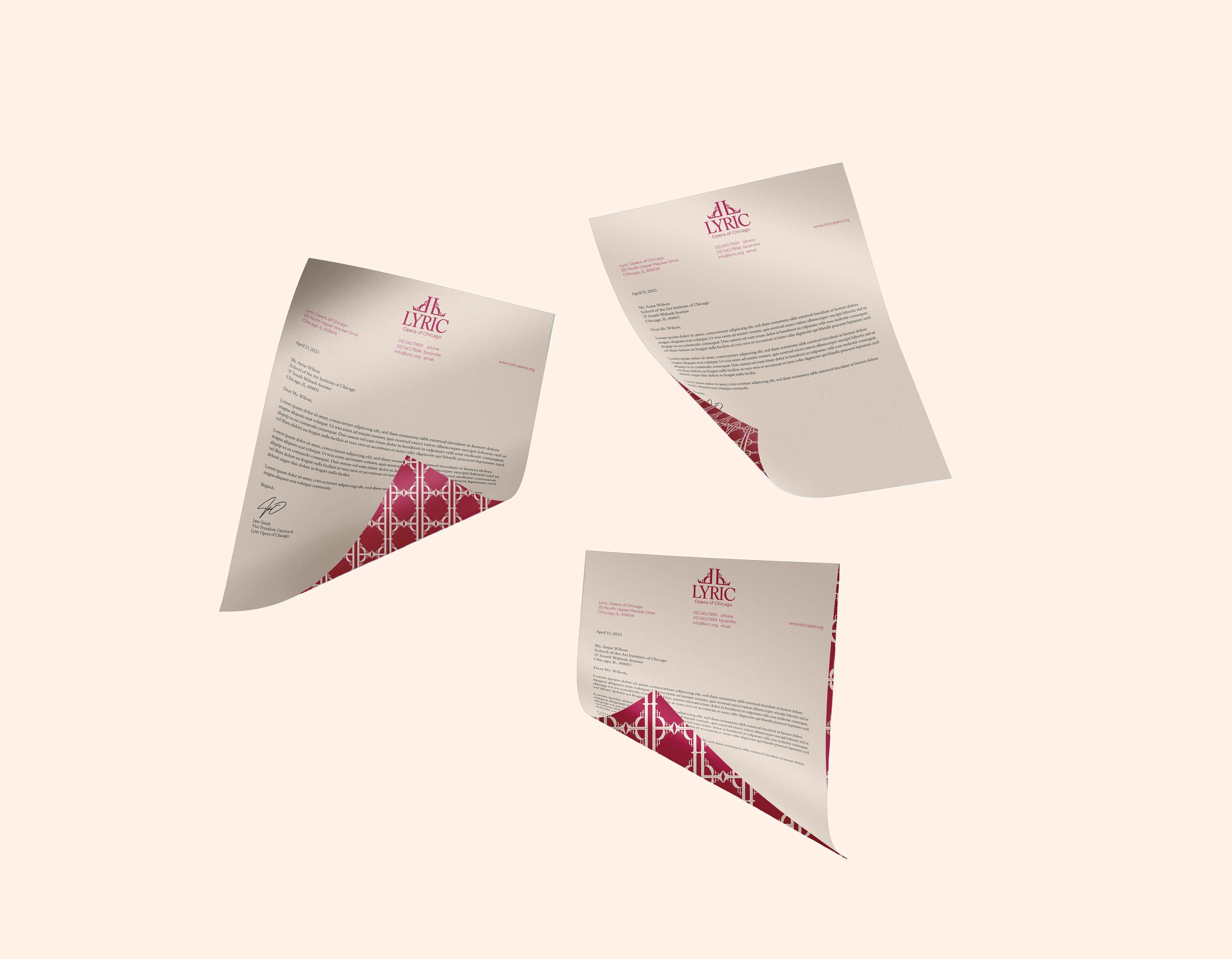
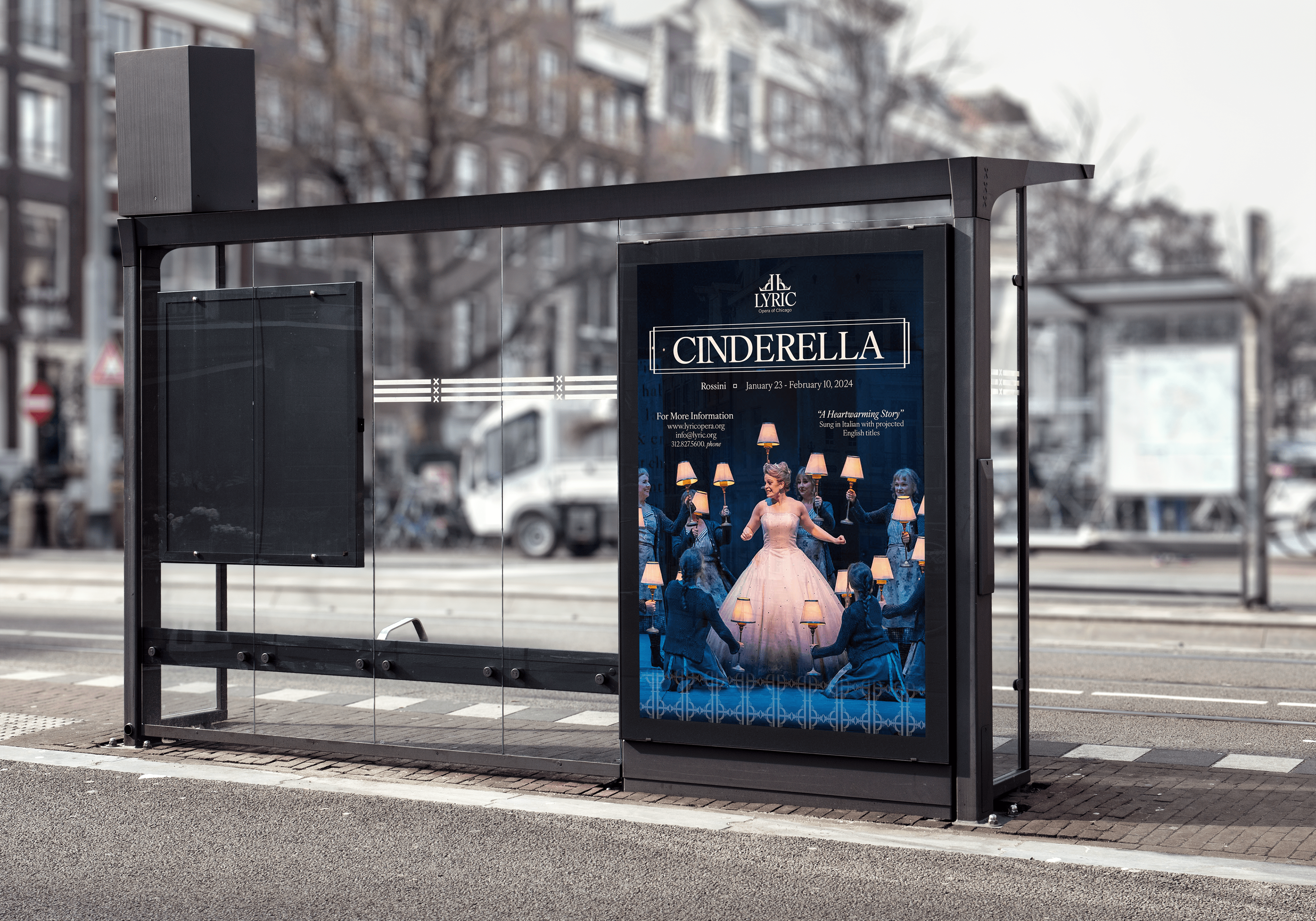
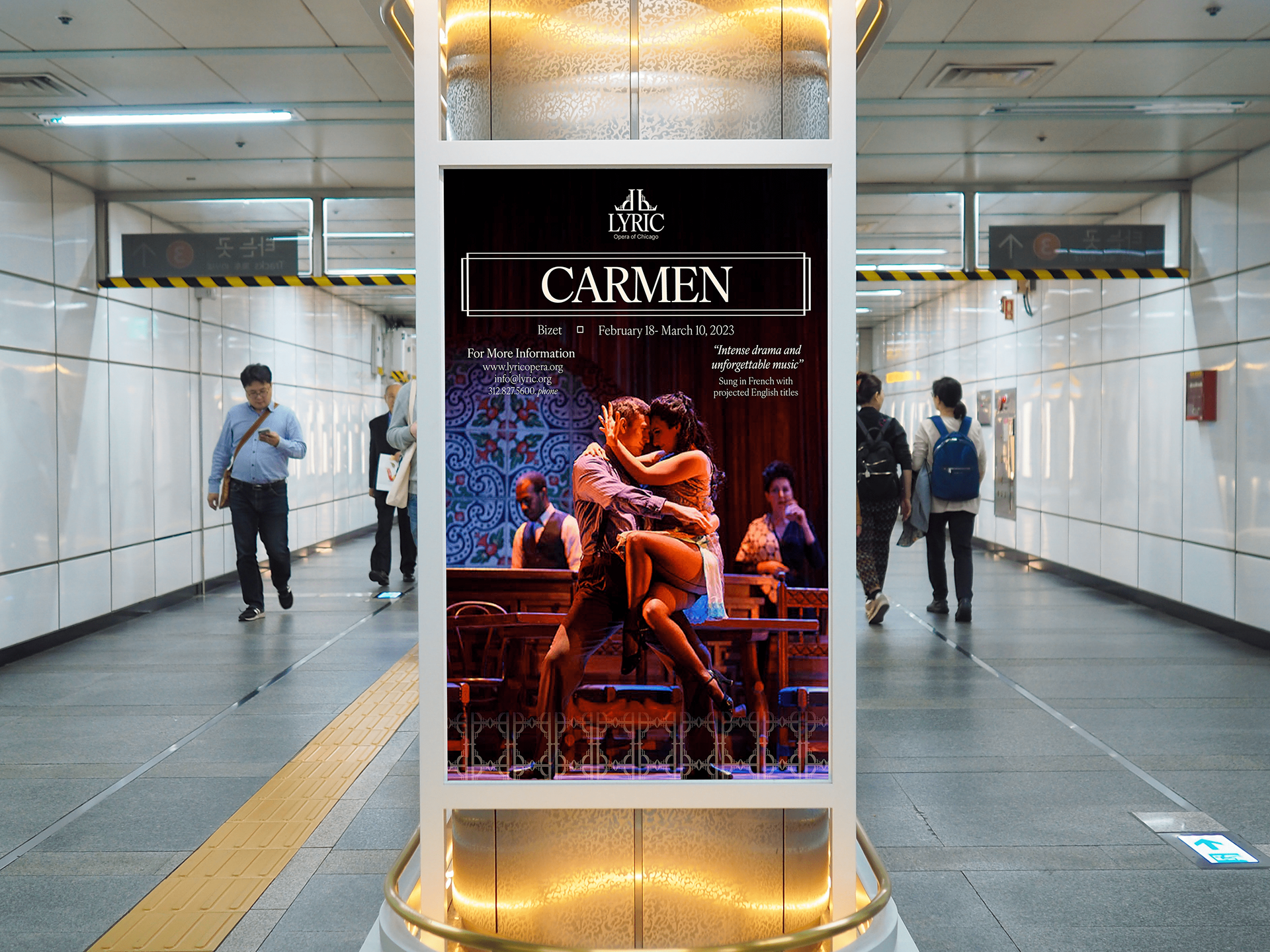
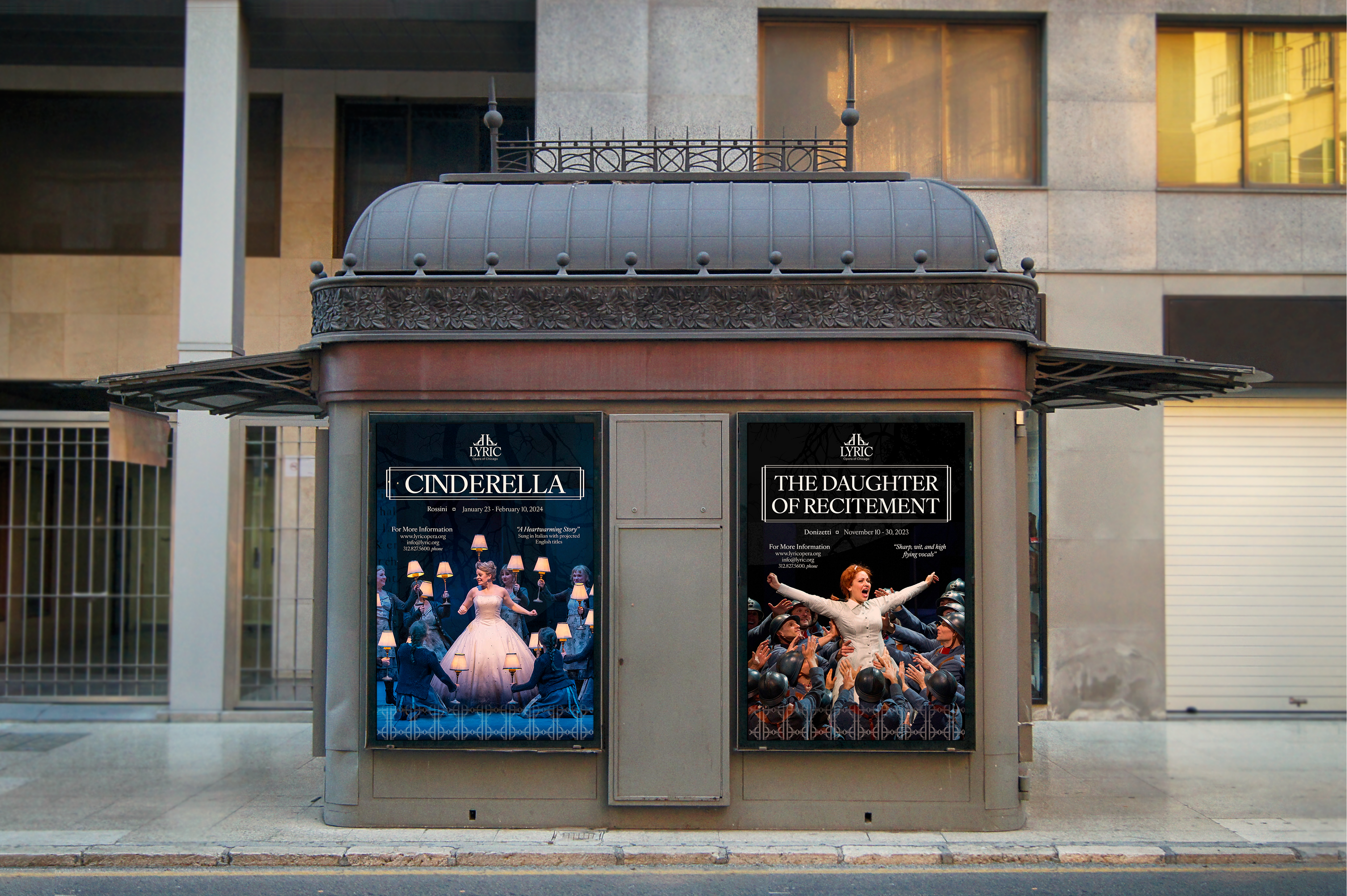
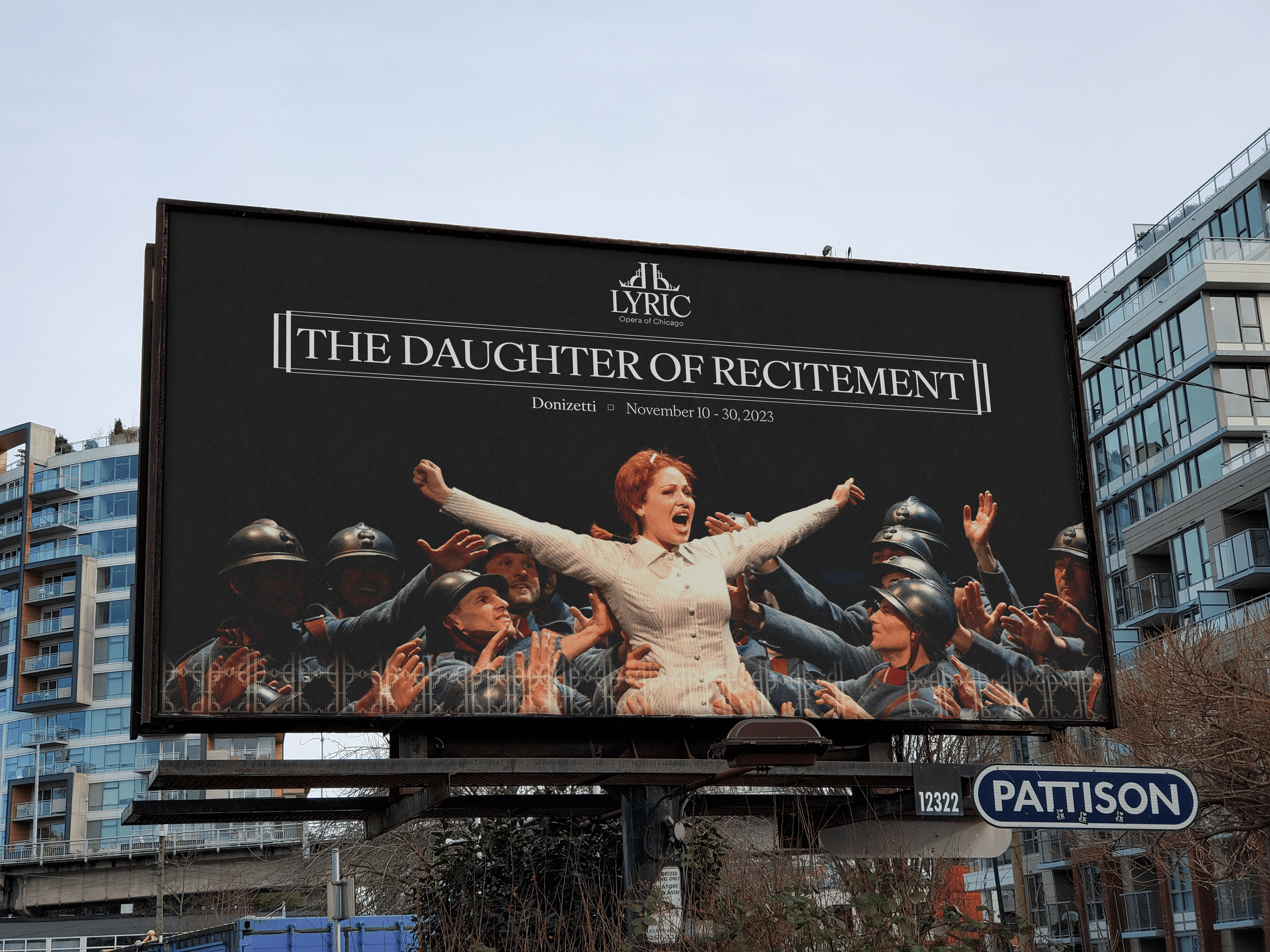
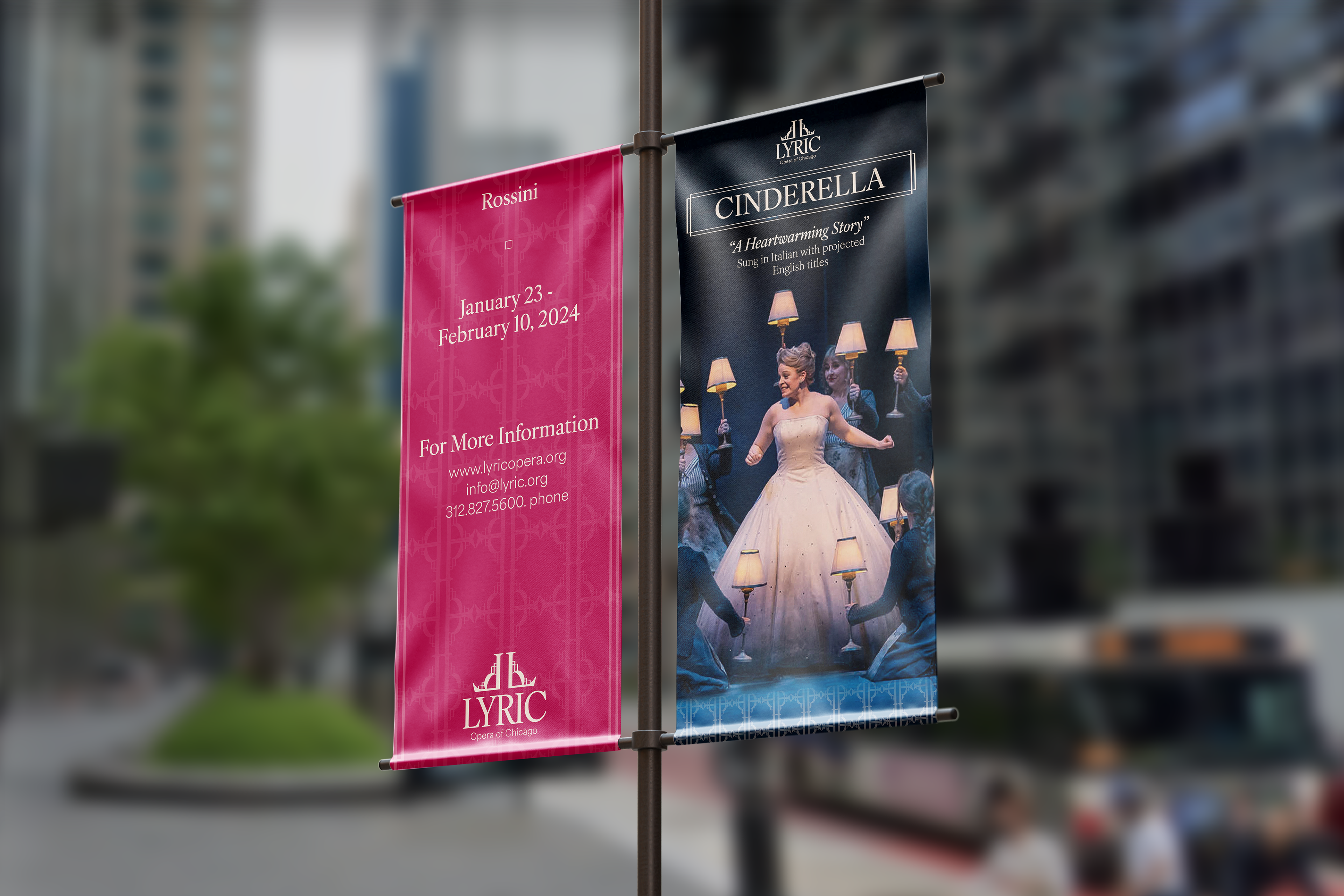
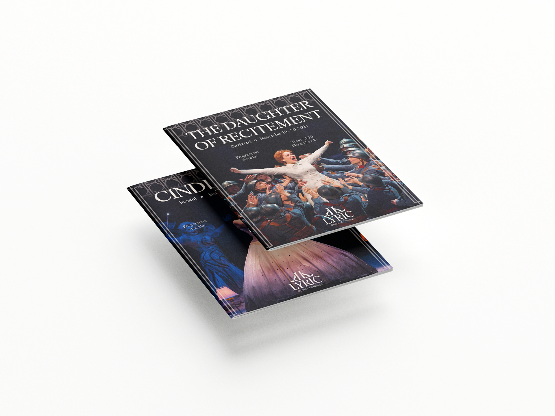
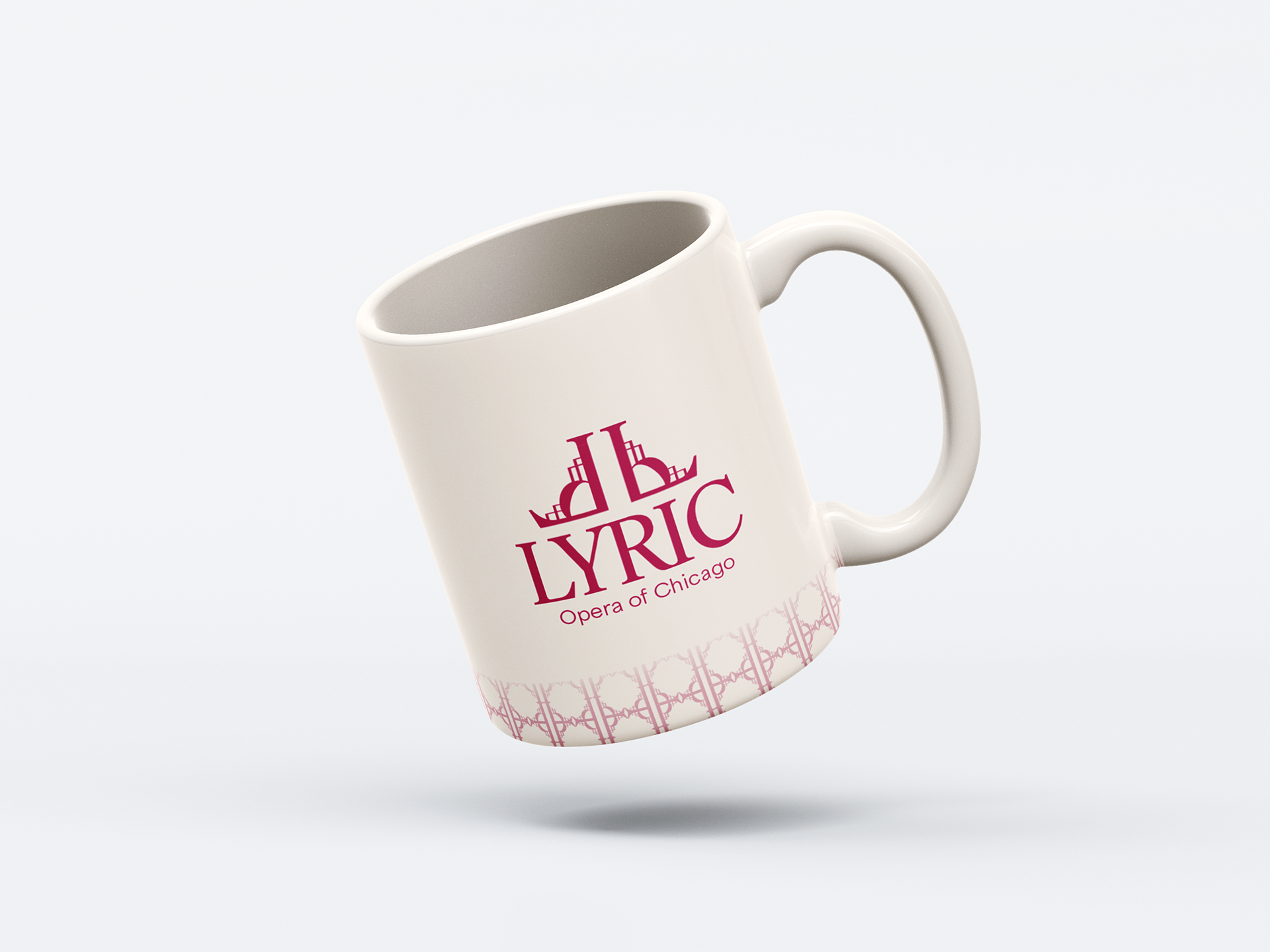
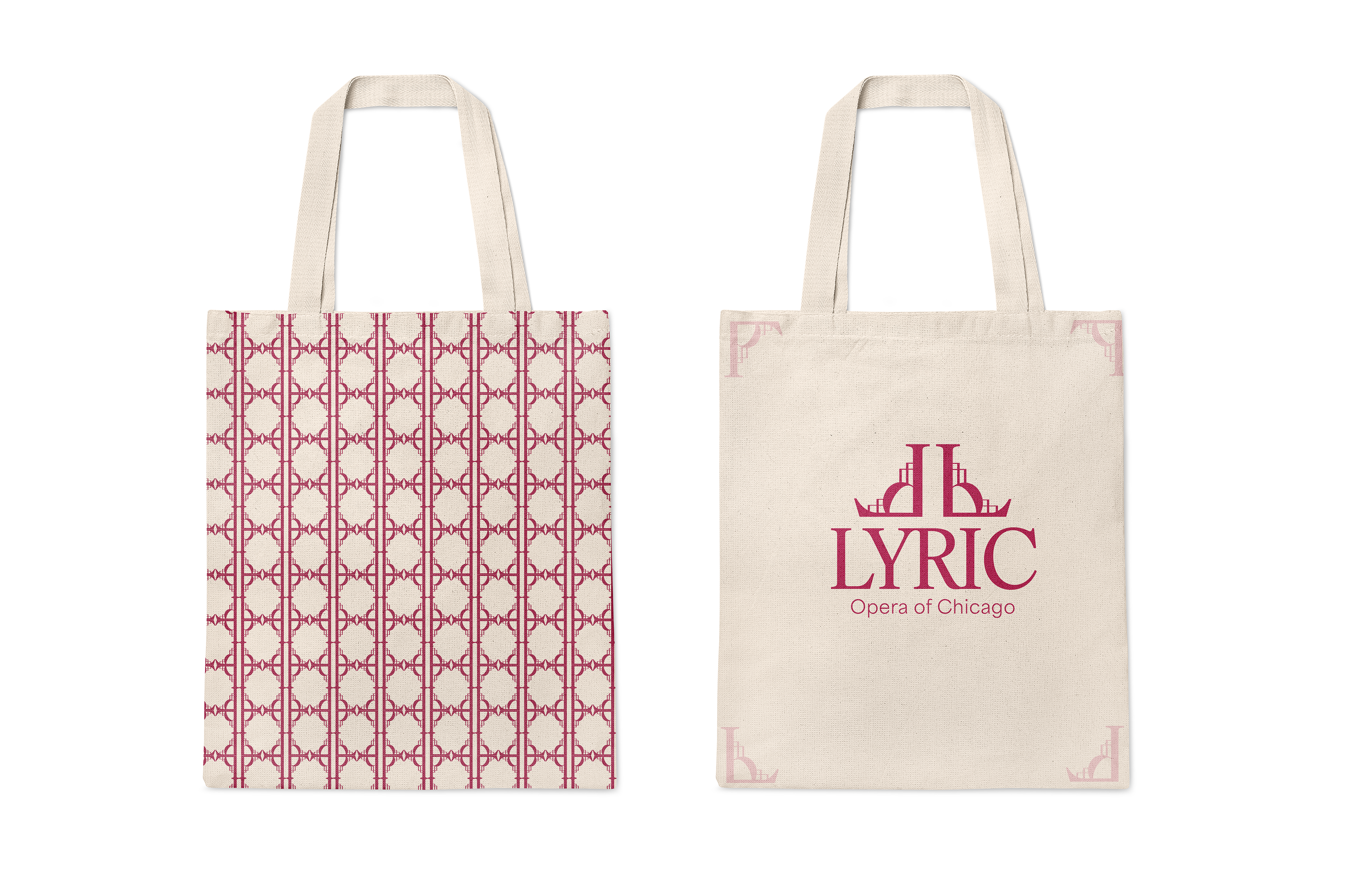
Application
Demonstrate the brand in use through stationery, posters, program booklets, way-finding, street signs, and social media presence.


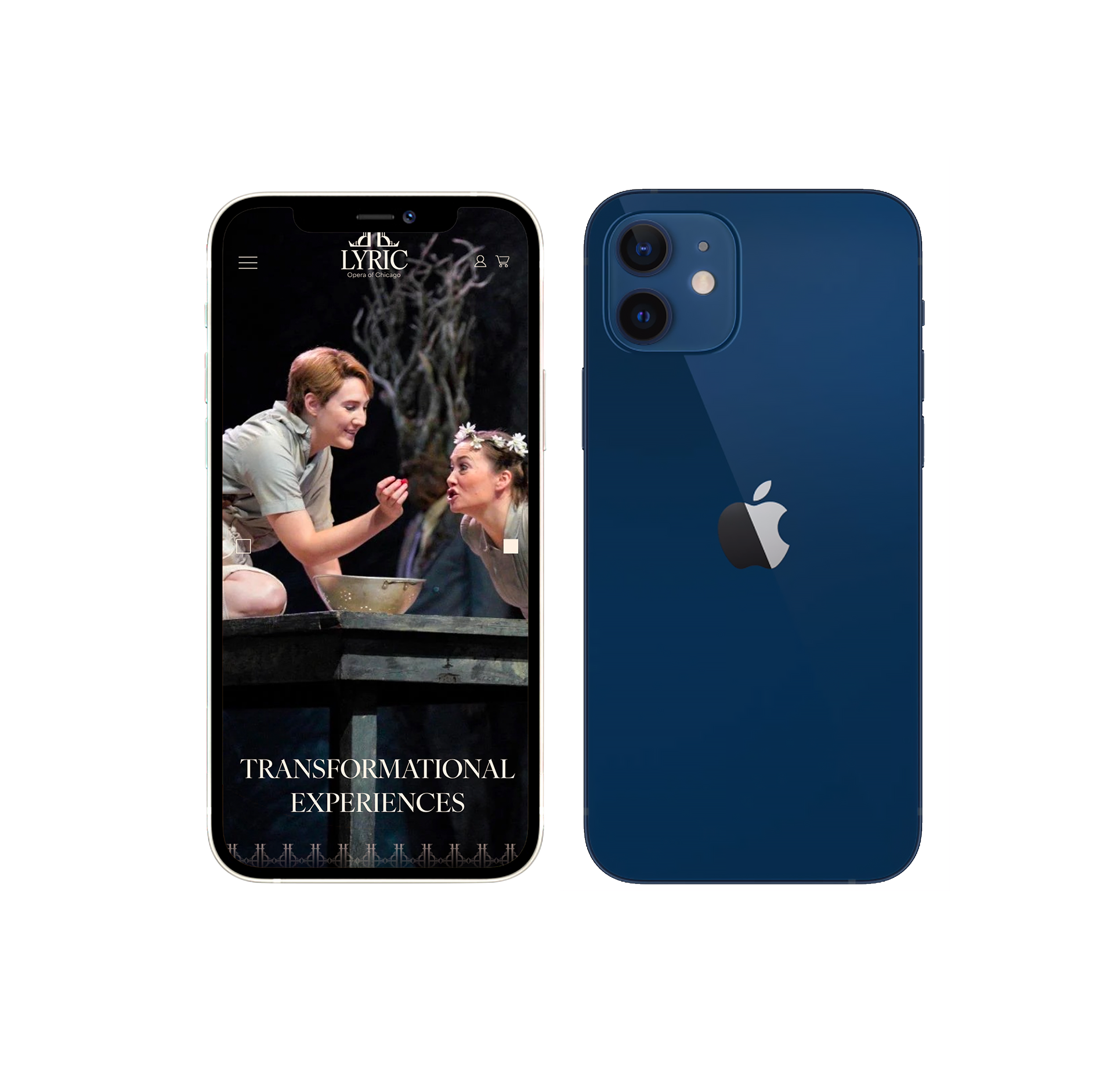
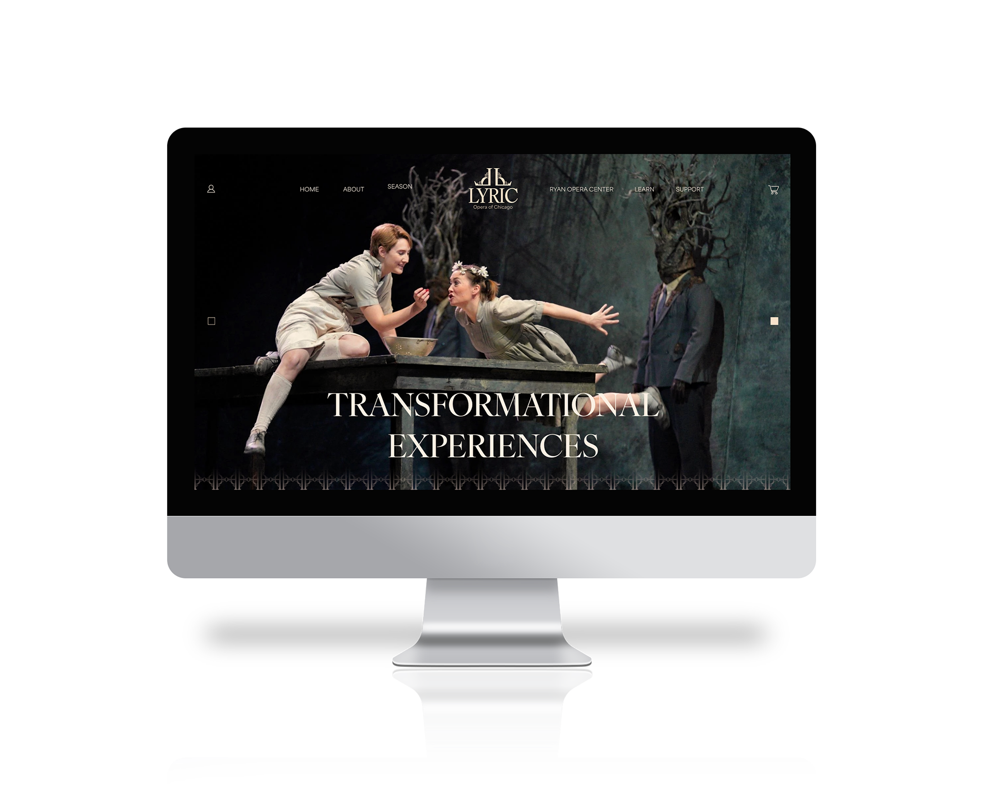
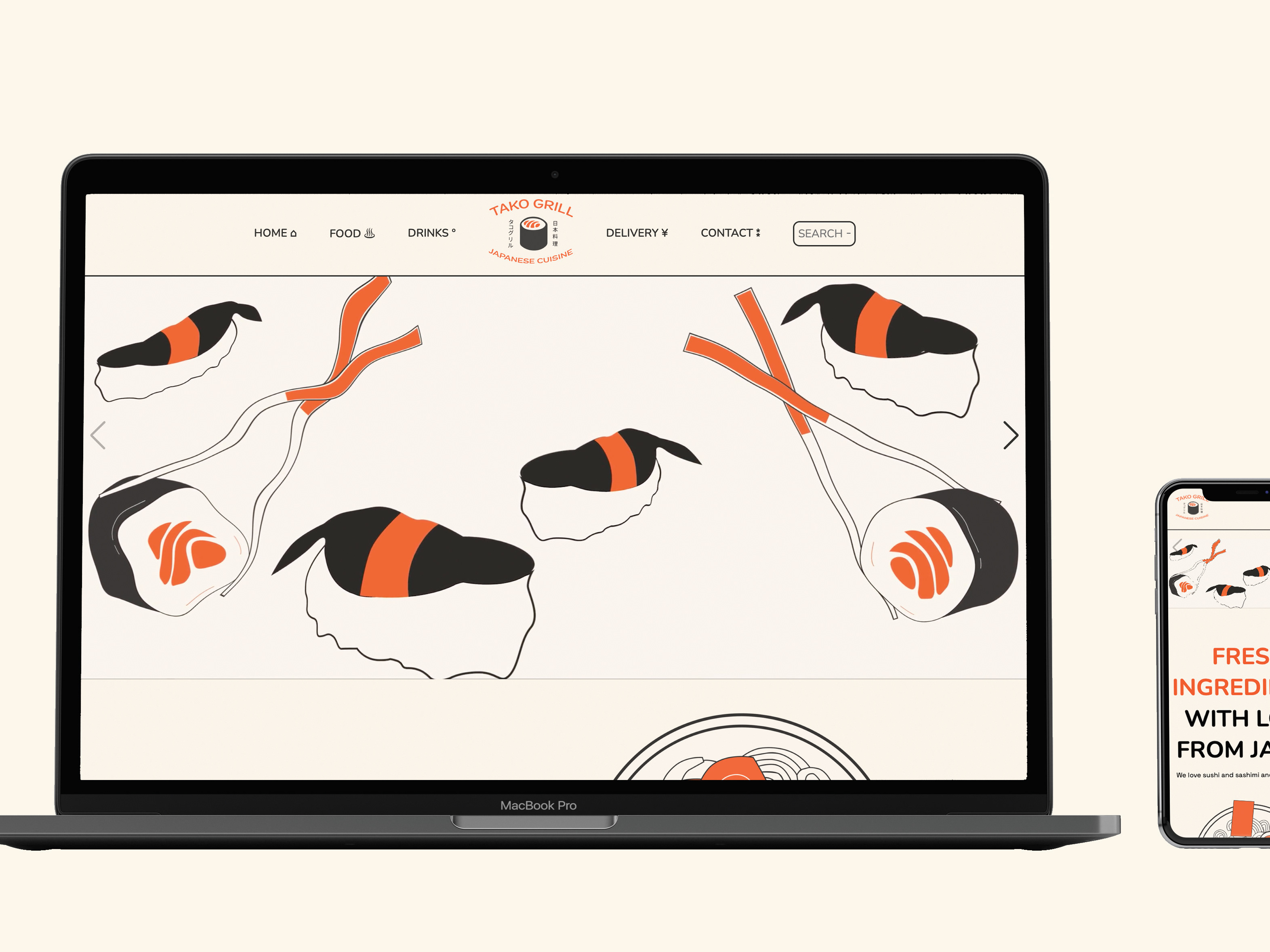
Interact with the website for both desktop and mobile below!
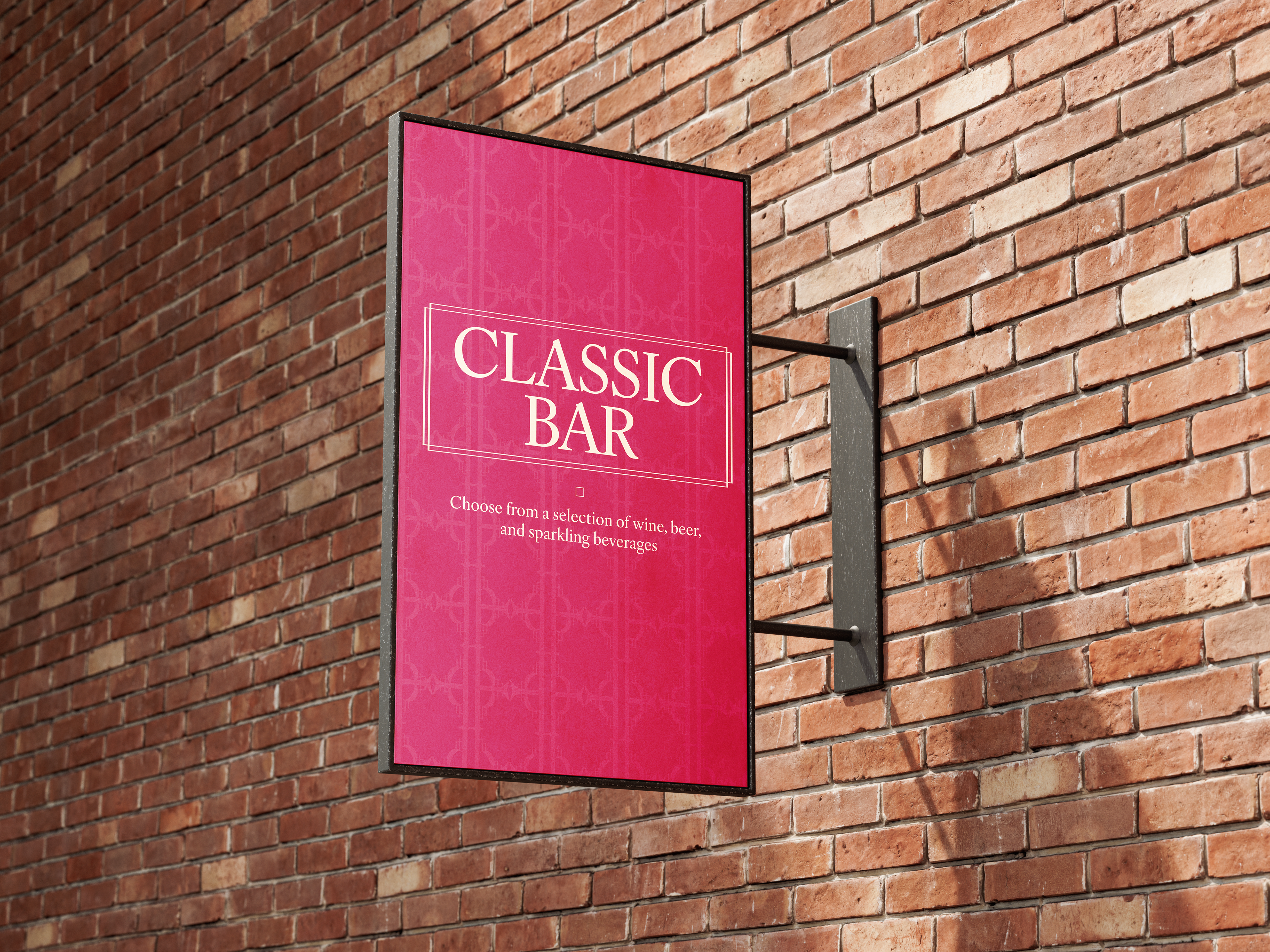
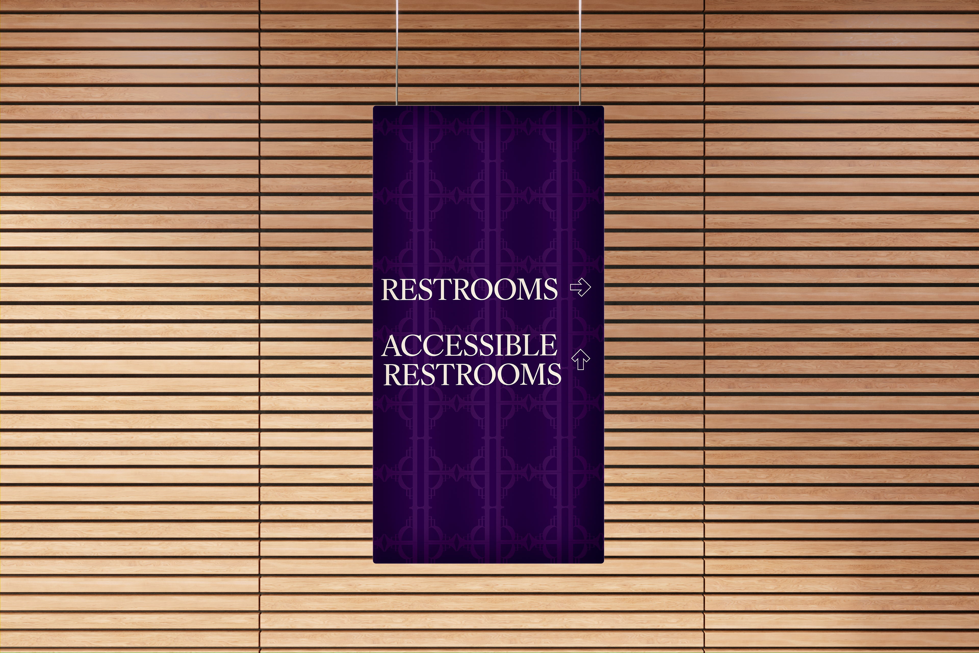
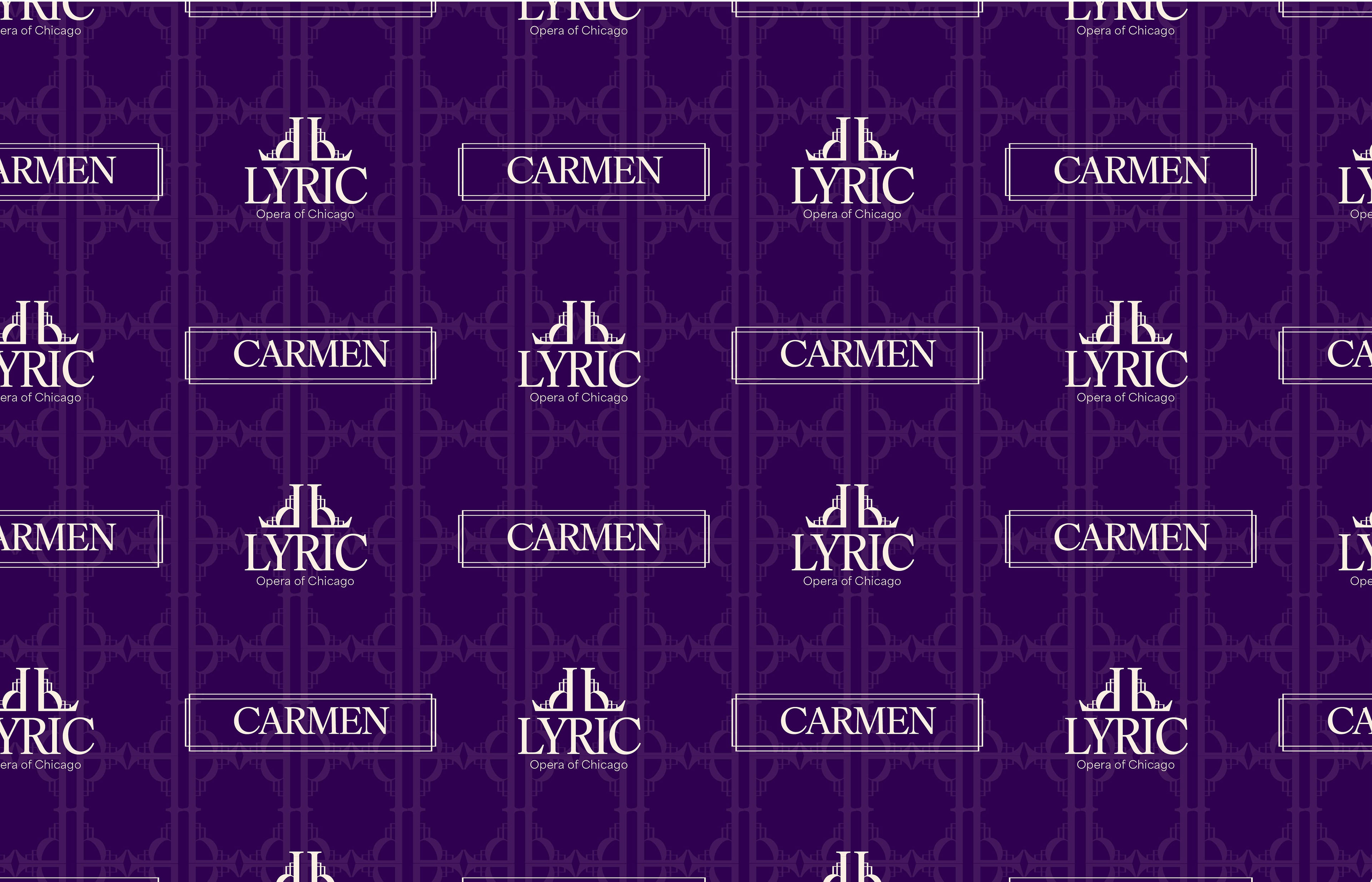
Photo Wall for Carmen
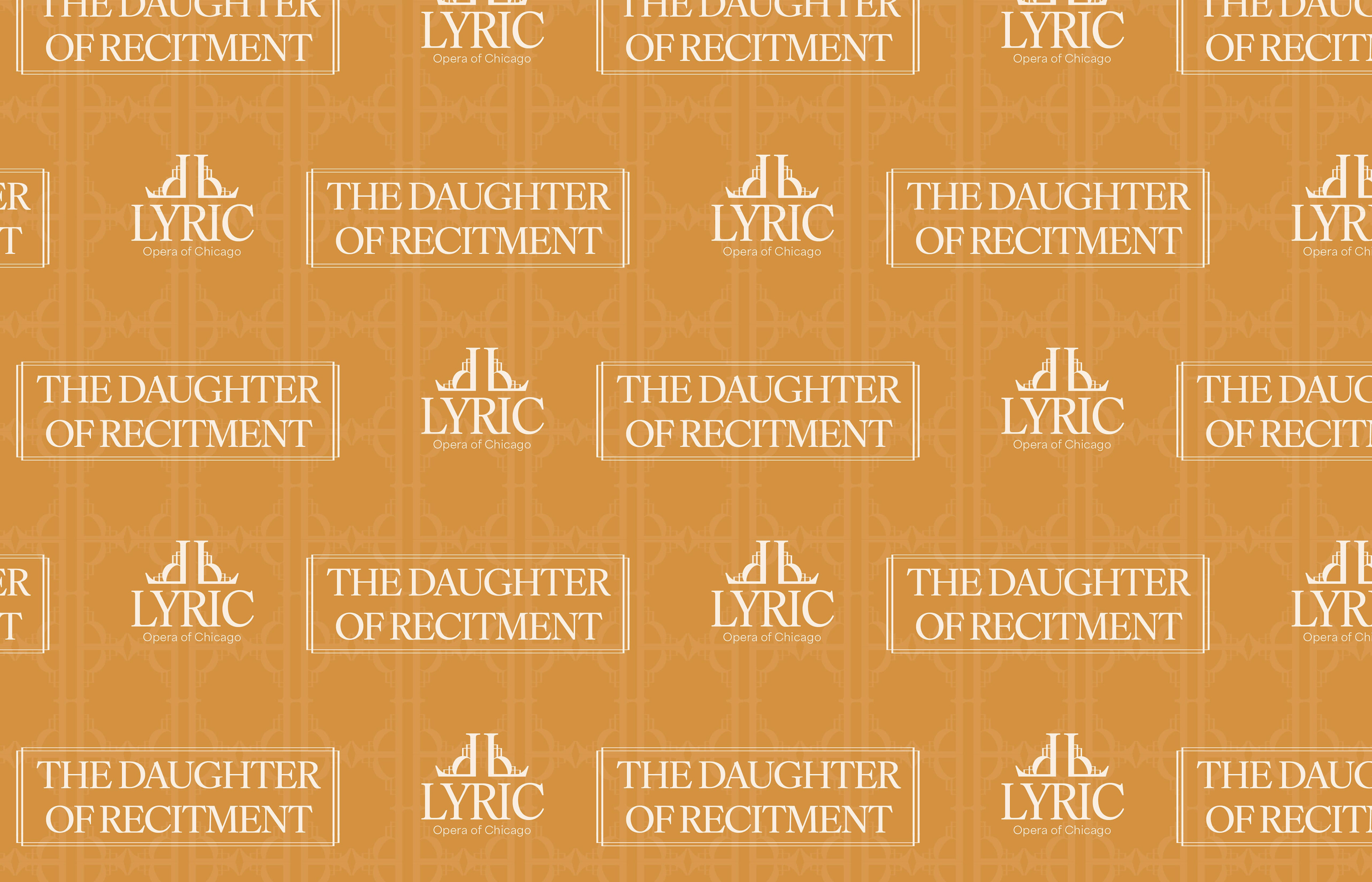
Photo Wall for The Daughter of Recitment
Mark Animation
To add at the start or end of their videos. Two versions are shown for flexibility.
Lyric Opera of Chicago Mark Animation
Lyric Opera of Chicago Mark Animation - Multimedia