Project Summary
Working closely with the Circles Creative and Marketing Team, I led a full visual identity creation of Circles' business venture of Jetpac - a travel eSIM to drive the company's new bold tech product. Our goal was to empower travelers to break out of the norm challenge the notion of traveling anywhere easily with global connectivity, and create a visual identity that encapsulates this purpose.
⎯⎯⎯⎯⎯
Role: Graphic Designer
Marketing and Content Lead: Pearlyn Yeo
Creative Design Lead: Janice Chan
Product Designer: Fadhli Sheik
Created in-house at Circles
Tools: Adobe Illustrator, Photoshop, Premiere Pro, After Effects, Figma
Logo Process
I began experimenting with using elements of a jetpack, such as the wings and steam. Most notably, the engine forming signal bars. Playing with negative space utilizing the 'J' to create the wings of the jetpack. However, none of these explorations represented the eSIM aspect as it leaned towards space.
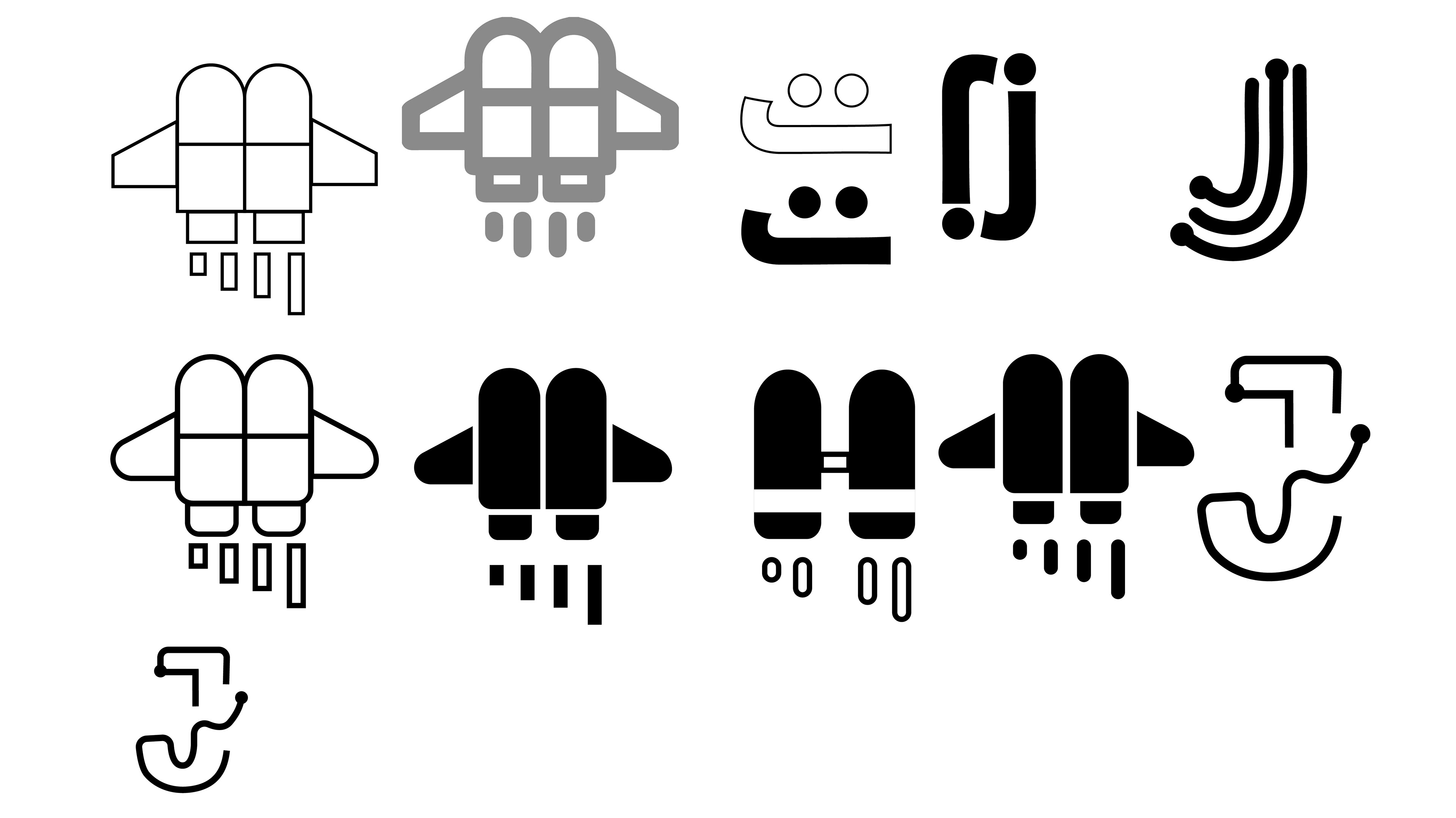
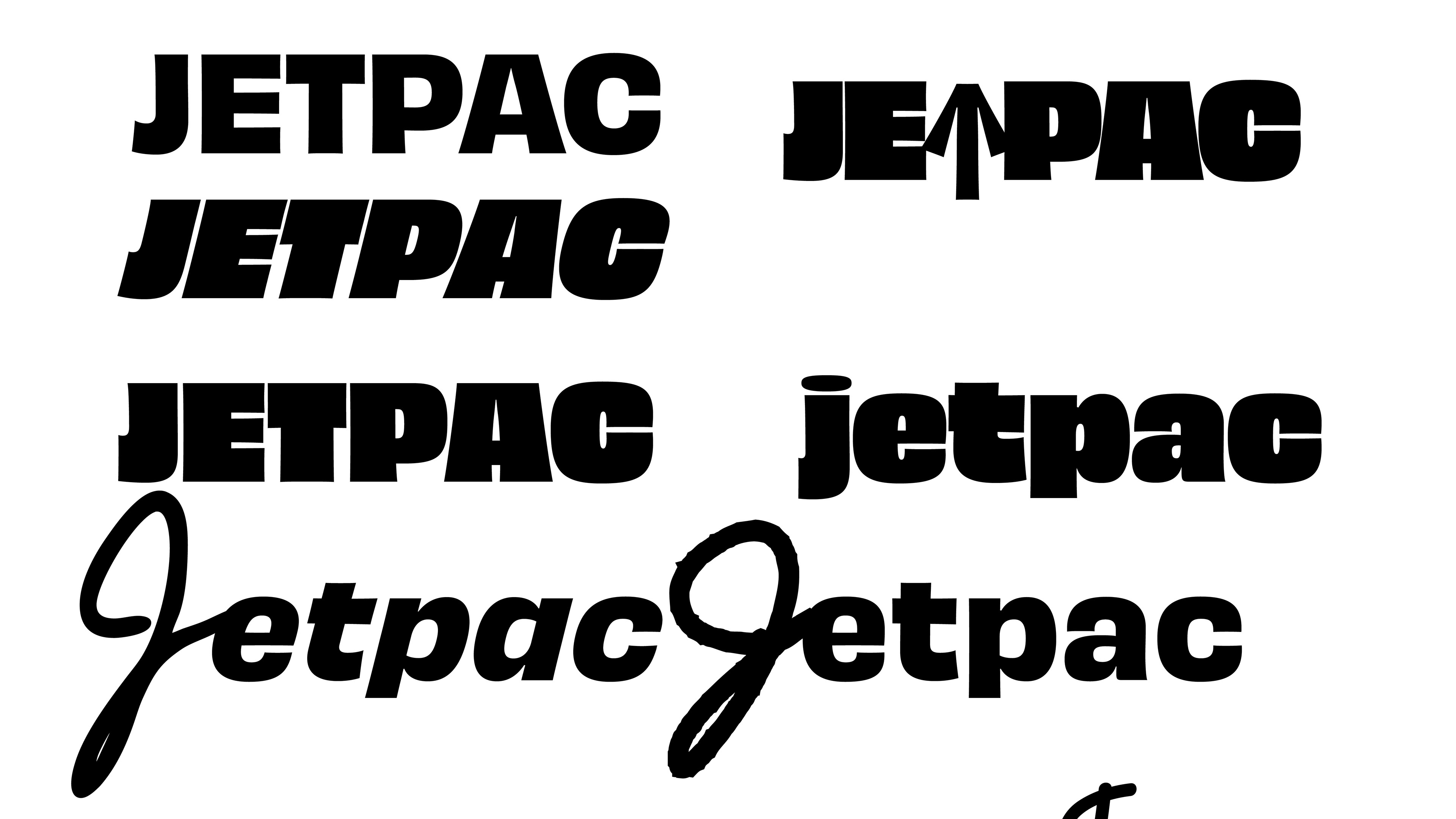
Implementing the letter 'J' into the signal waves that evolved into clip masking the a bold letter 'J' after realising the arc of the stem produced an awkward gap between each signal. Further experimentation with rounding the edges, sharpening the corners, and clip masking proceeded.
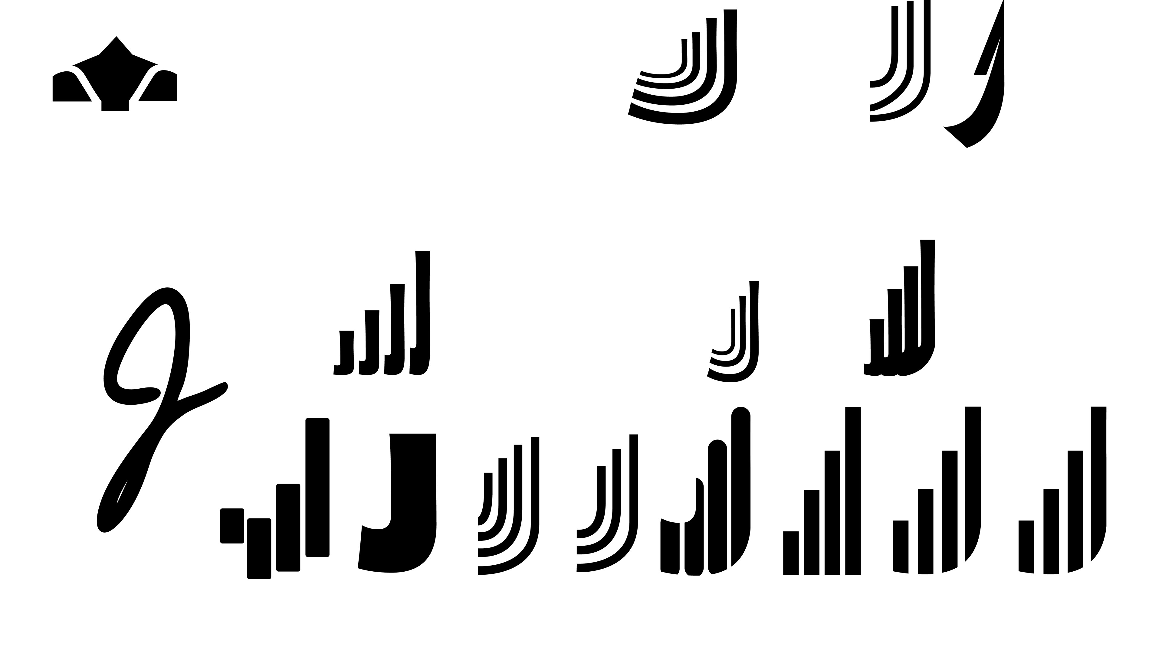
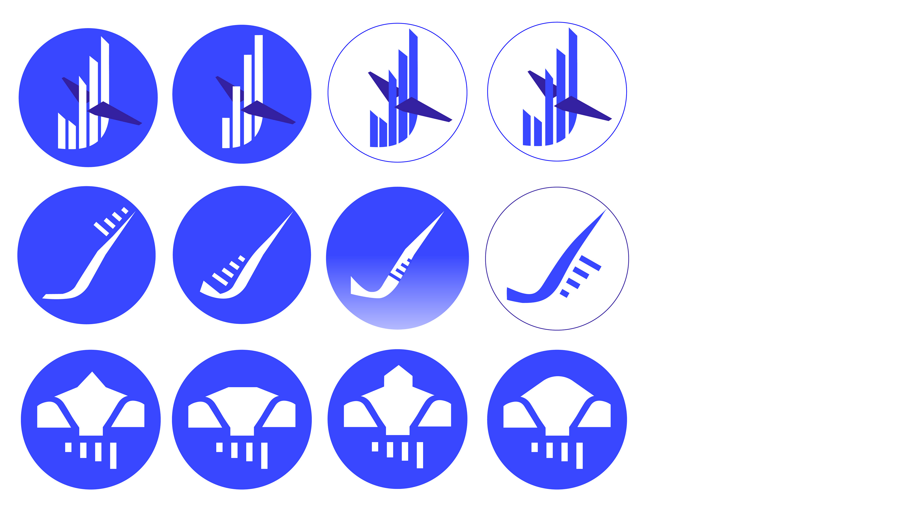
First drafts that integrate the plane wings with the 'J' shaped signals. Experimented with the placement from the edge to the top alongside different treatments to the signals.


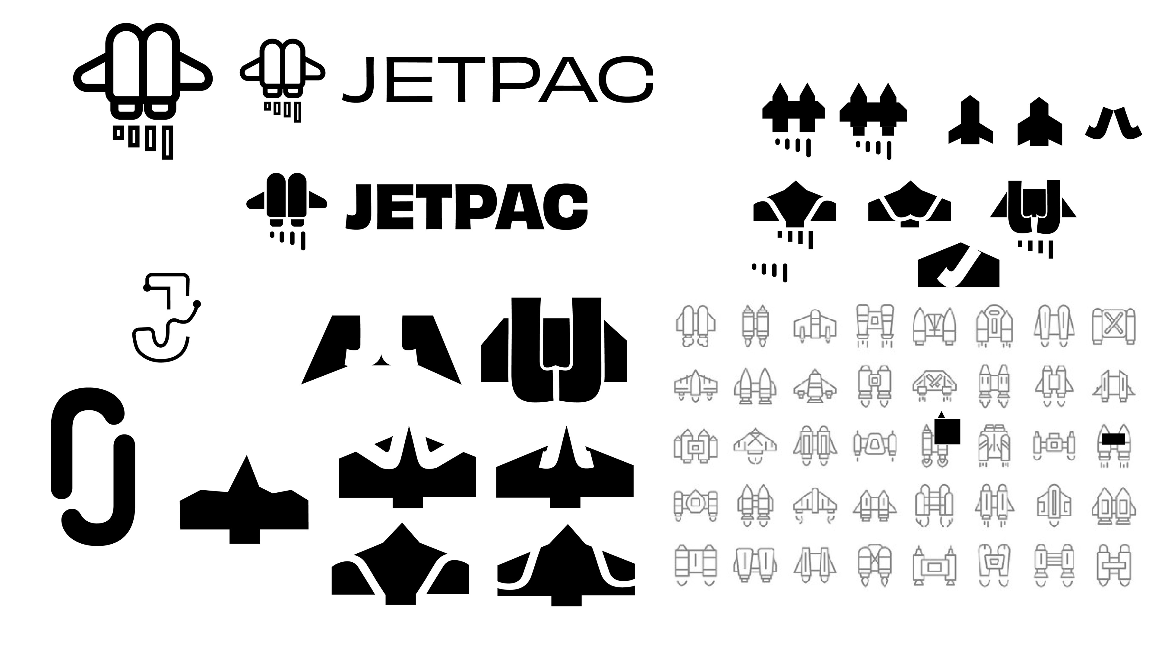
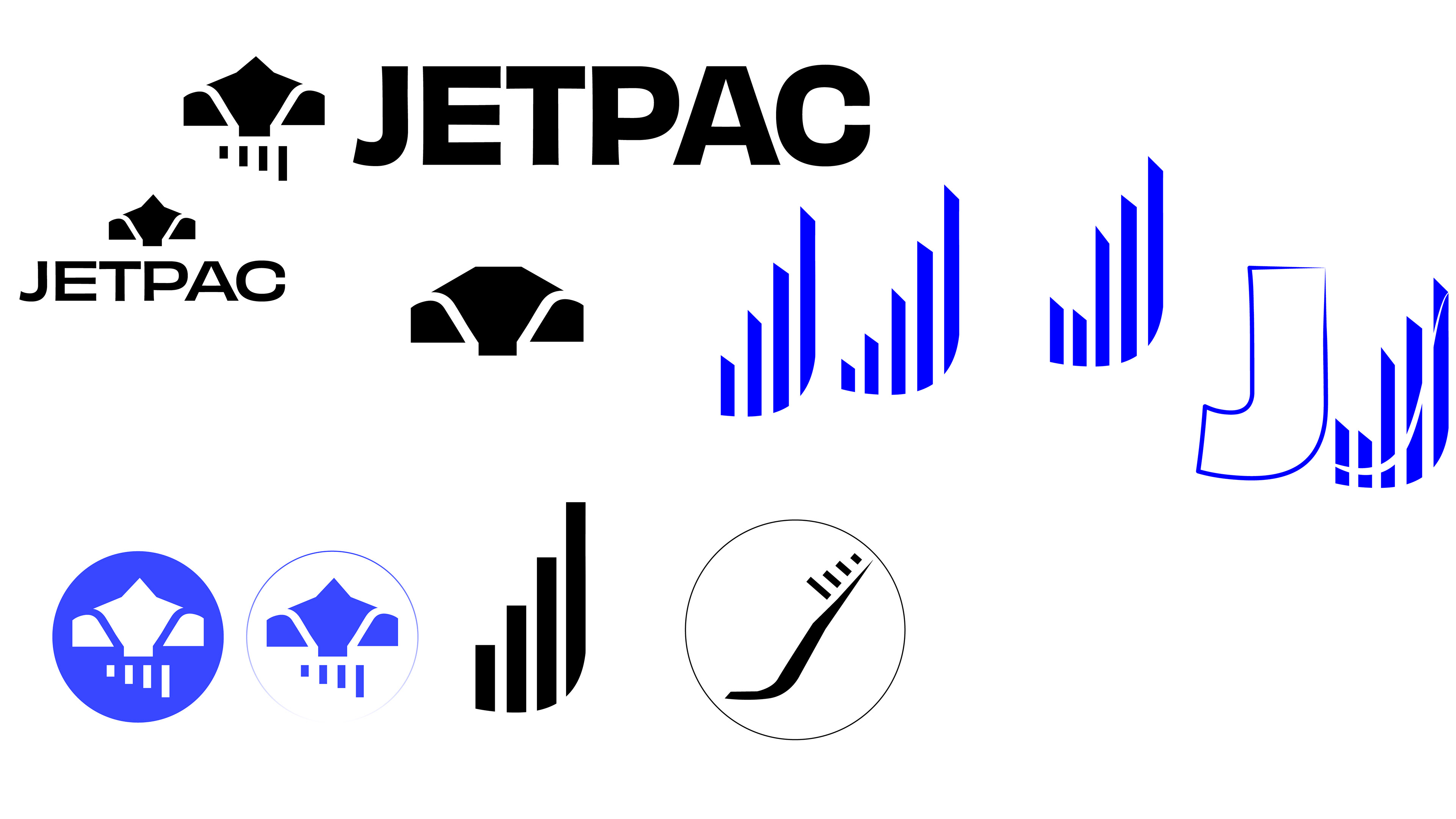
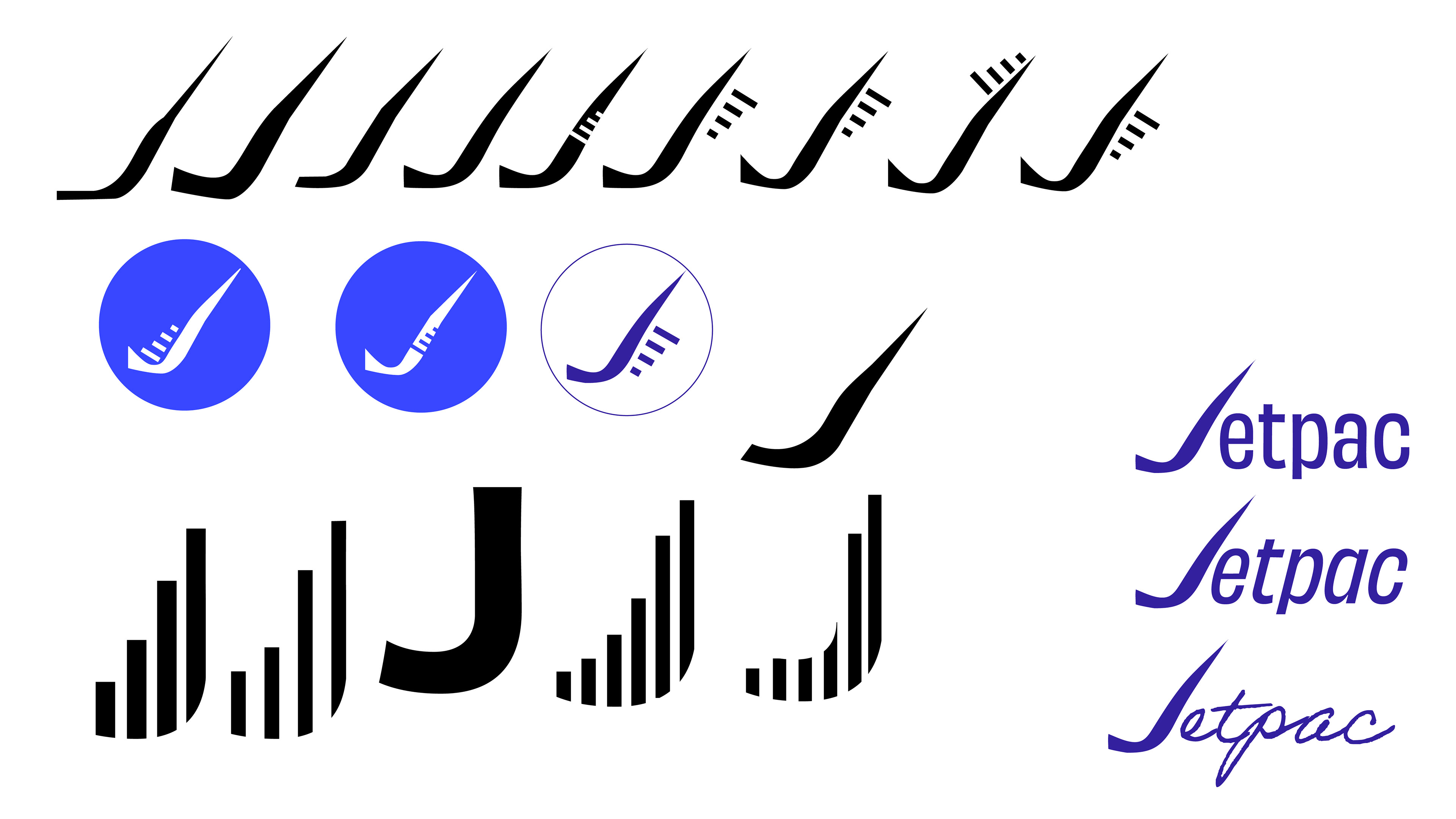
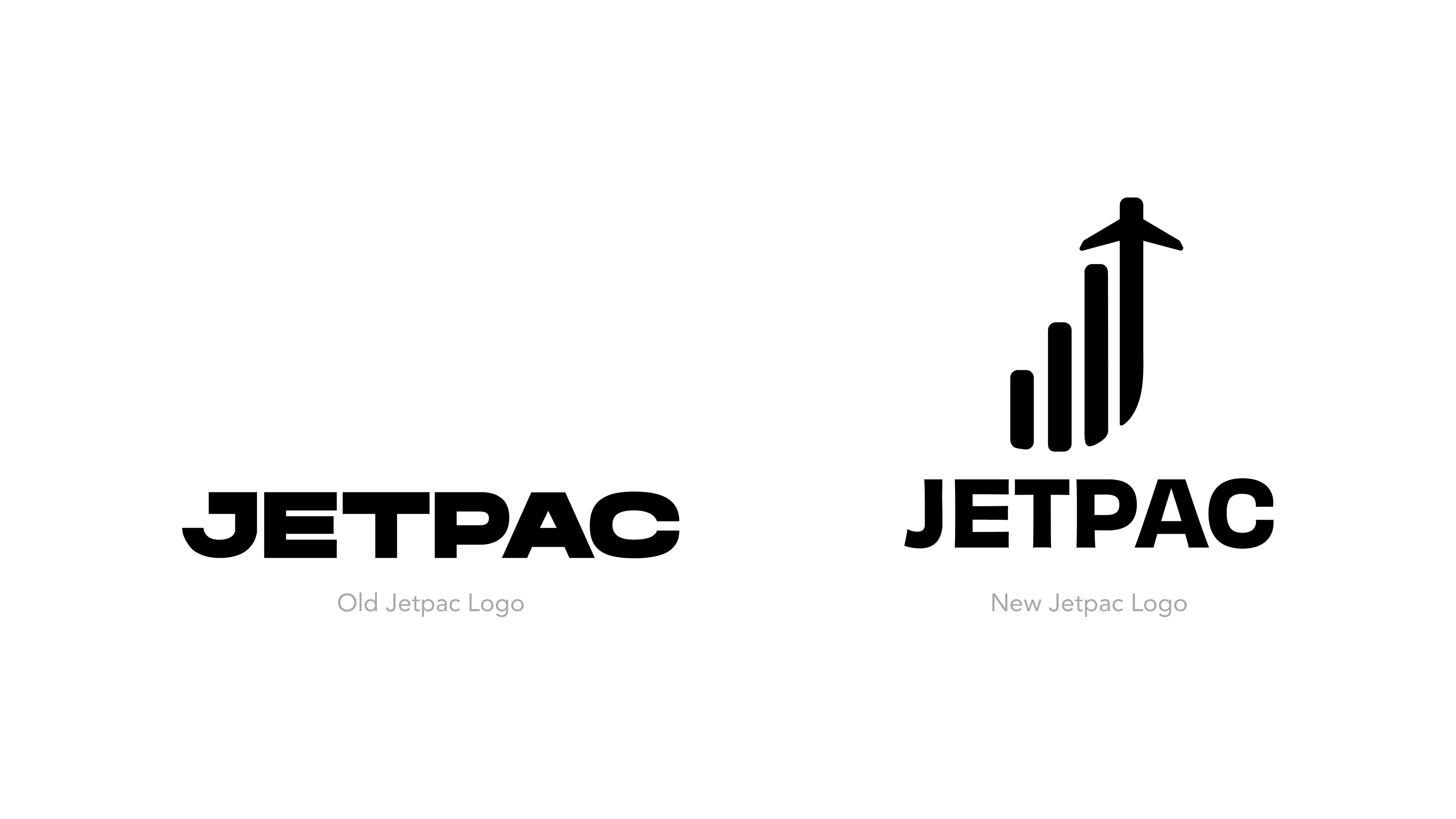
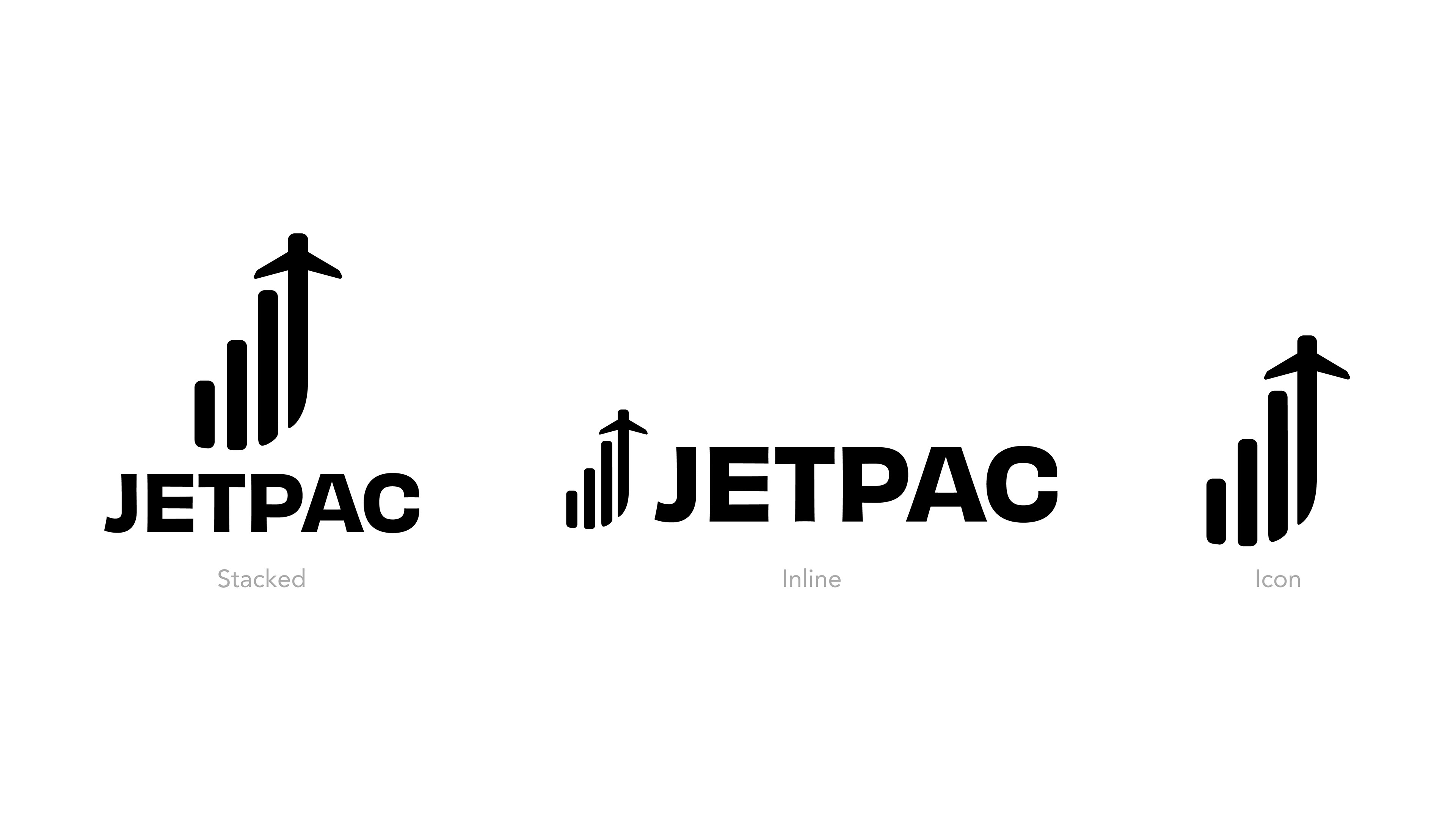
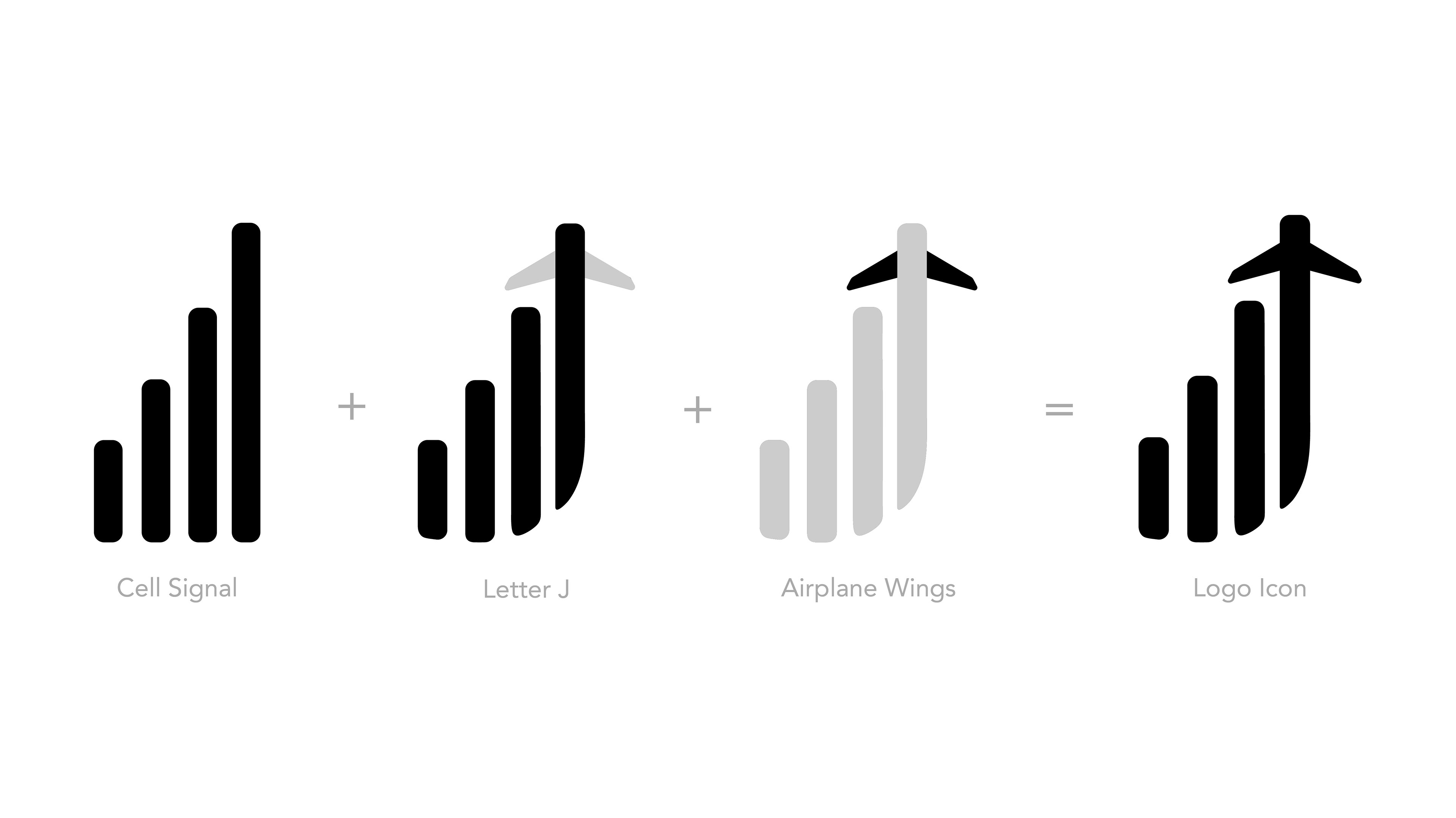
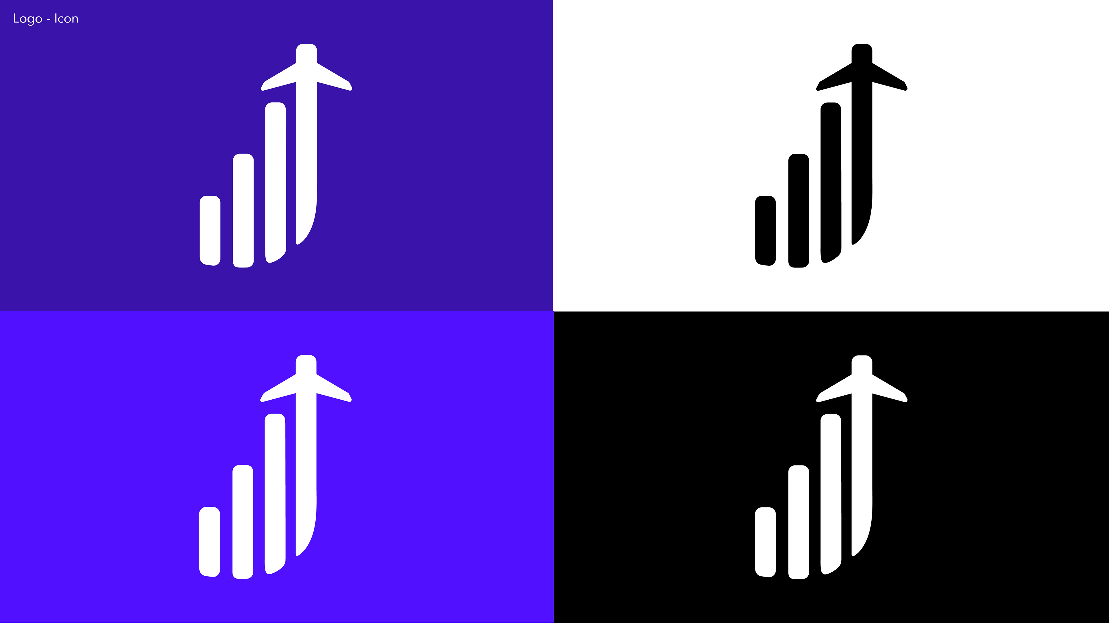
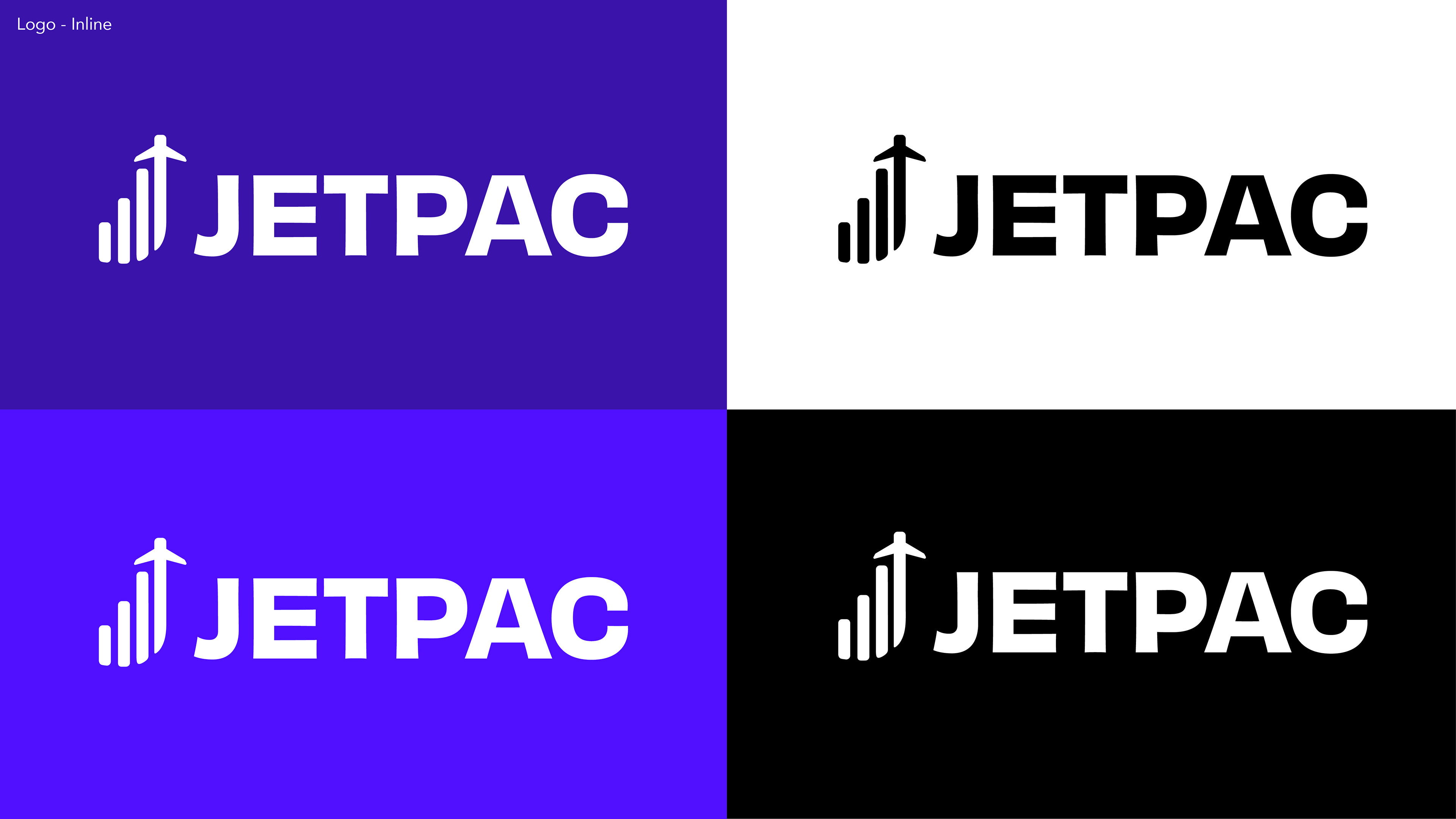
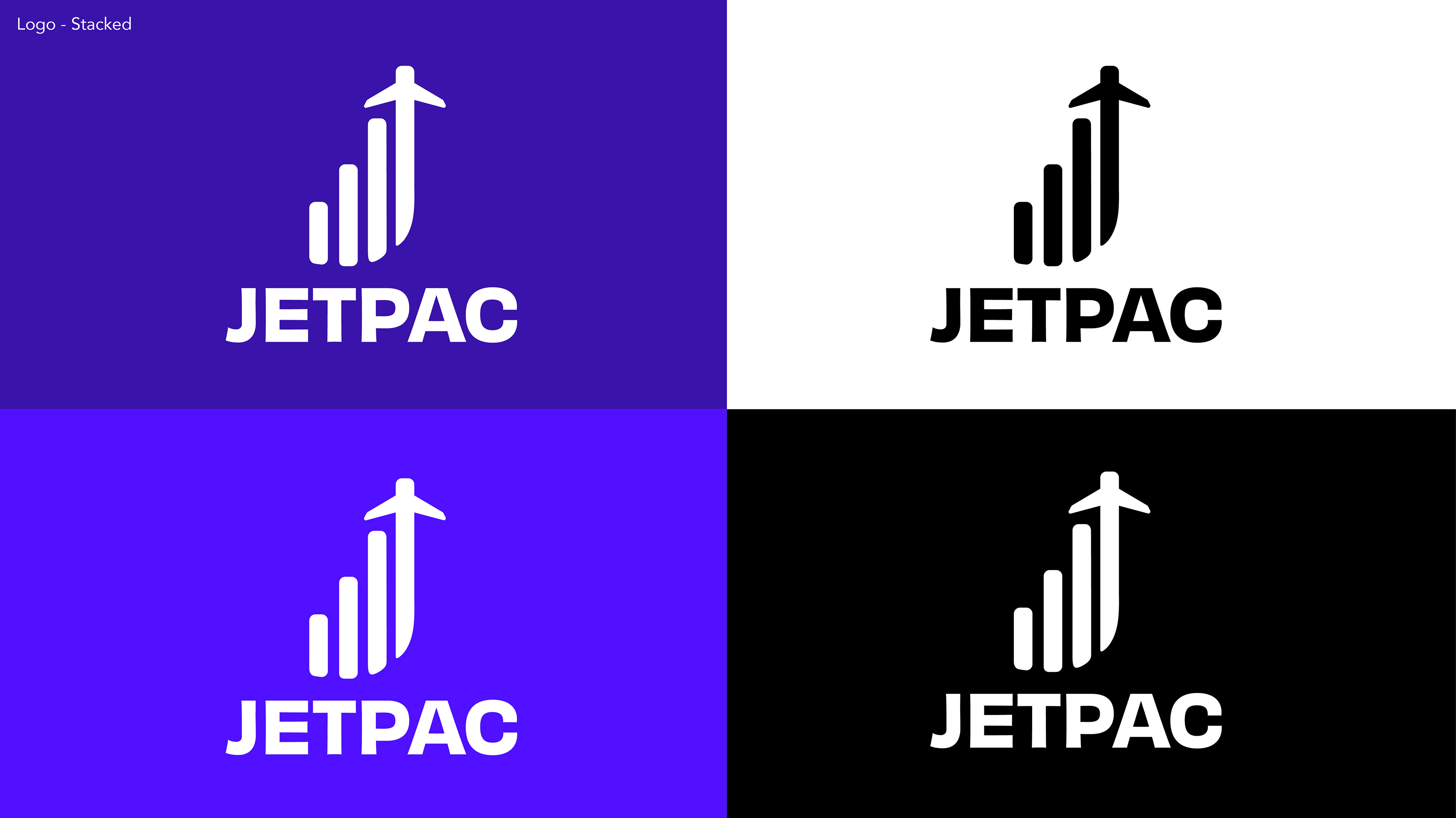
Final Logo
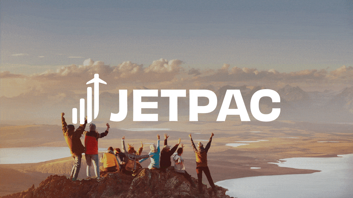
Combining elements of a SIM signal and an airplane for travel, I created a new logo to represent the main elements to provide travellers a general idea of our brand at first glance. The shape of the signals also resembles the letter 'J' in Jetpac, adding more depth to the brand. Rounded the edges to provide a warm and welcoming tone and to reduce the harshness.
Colour
Dark blue-purple is the primary colour used with light green and orange. Whilst the secondary colour is a bright blue, combined with the neutrals of an off-black and white.
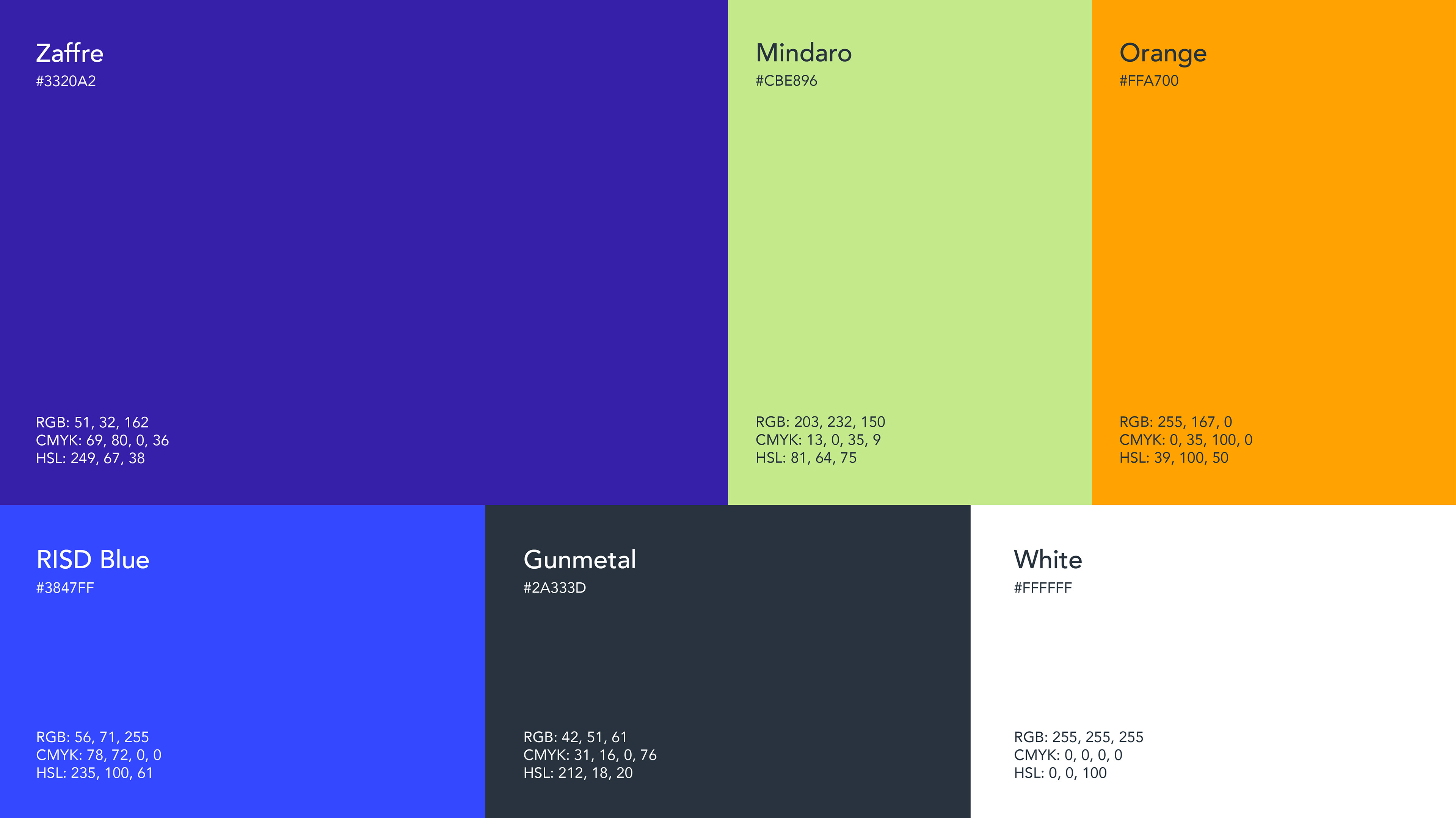
Logo with Colour
Applying the colour scheme
Main Jetpac logo
CRM Banners
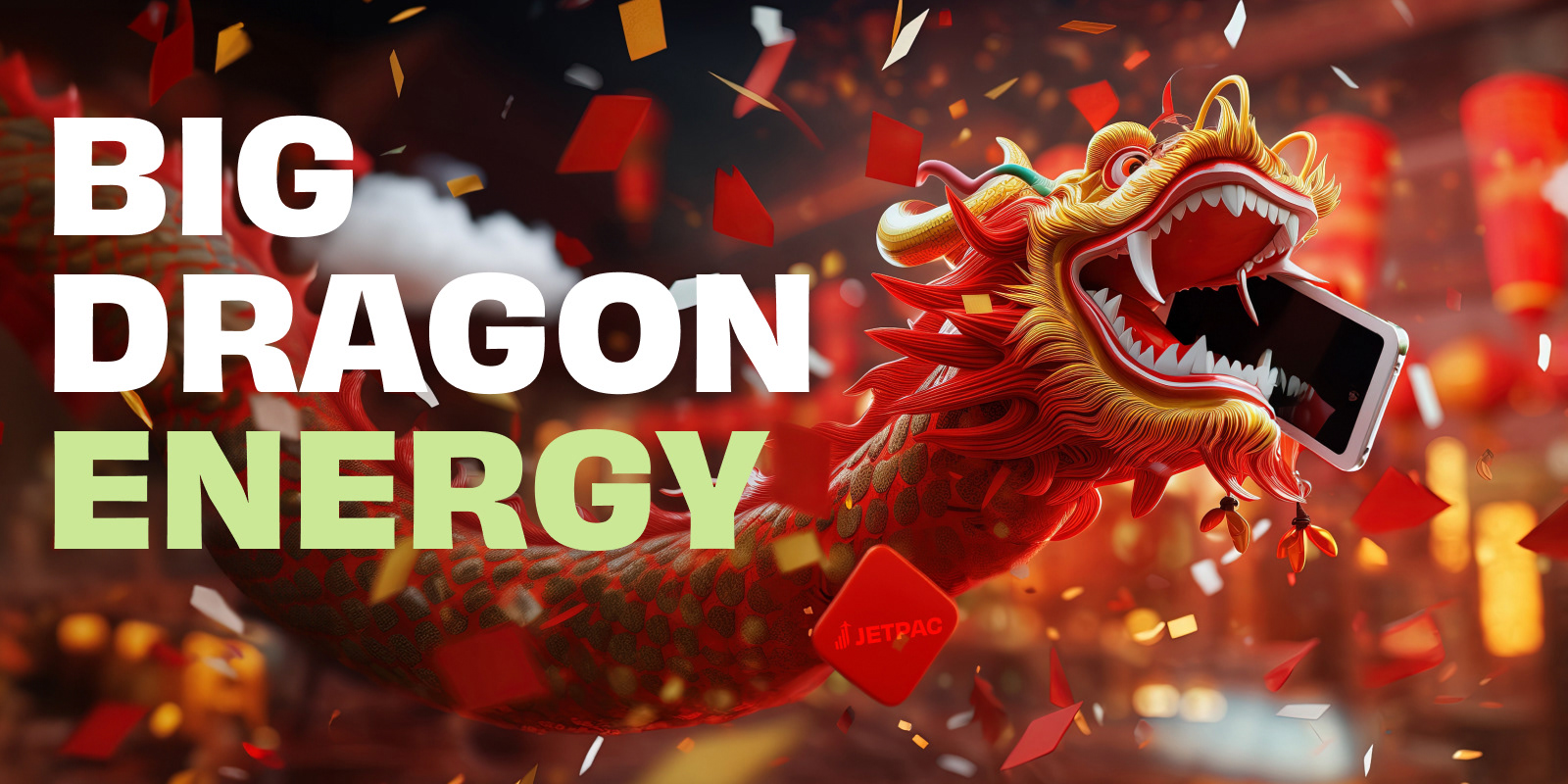
Designed a variety of CRM banners for specific campaigns that adhered to the brand guidelines and style. Each graphic related to the current event happening at the time to connect with users more, such as 12.12 with the gift wrapping and 2.2 with the Chinese dragons.

12.12
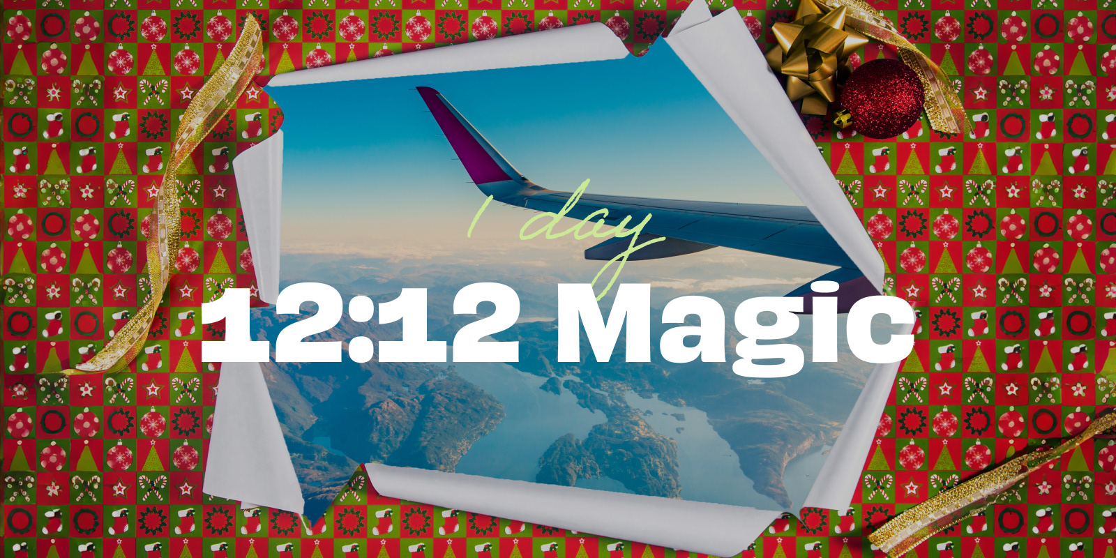
12.12
Single packs

10.10
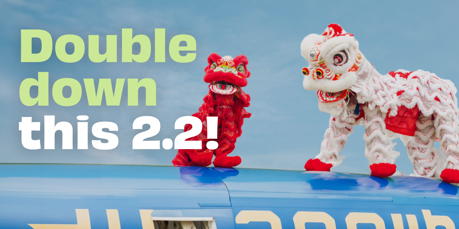
2.2

CNY Sale
CNY Sale Follow up

3.3

March Holidays
Public Relations Content
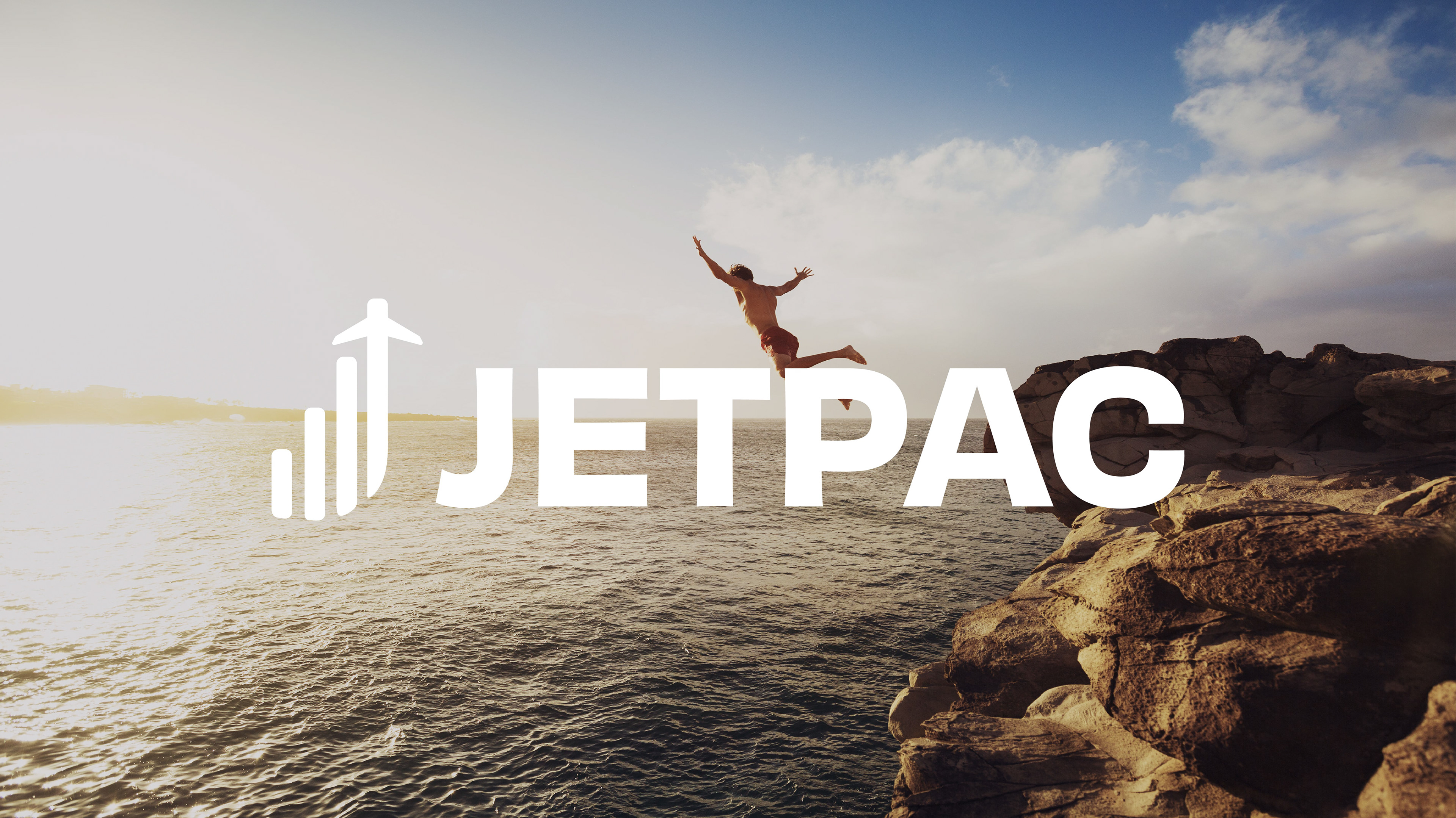
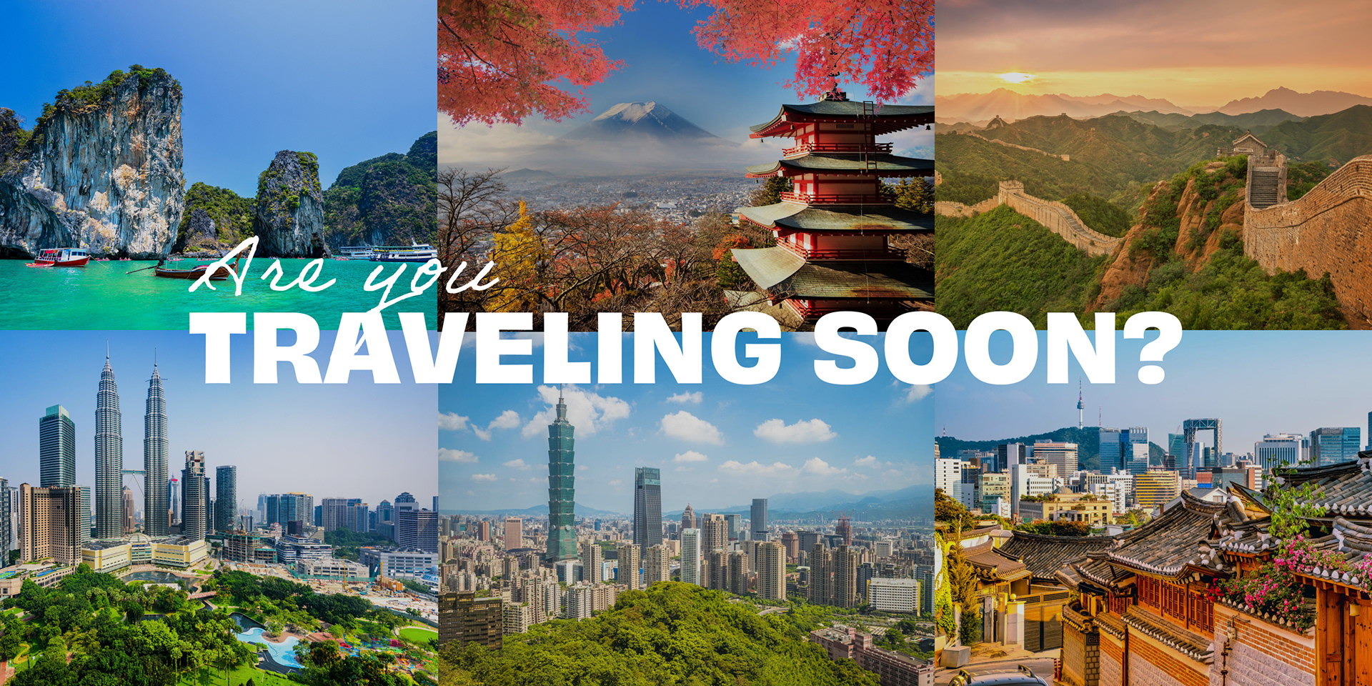
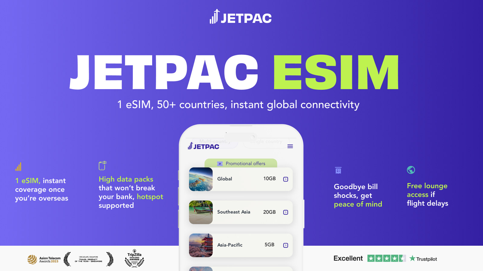
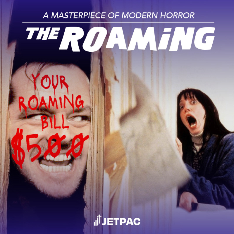
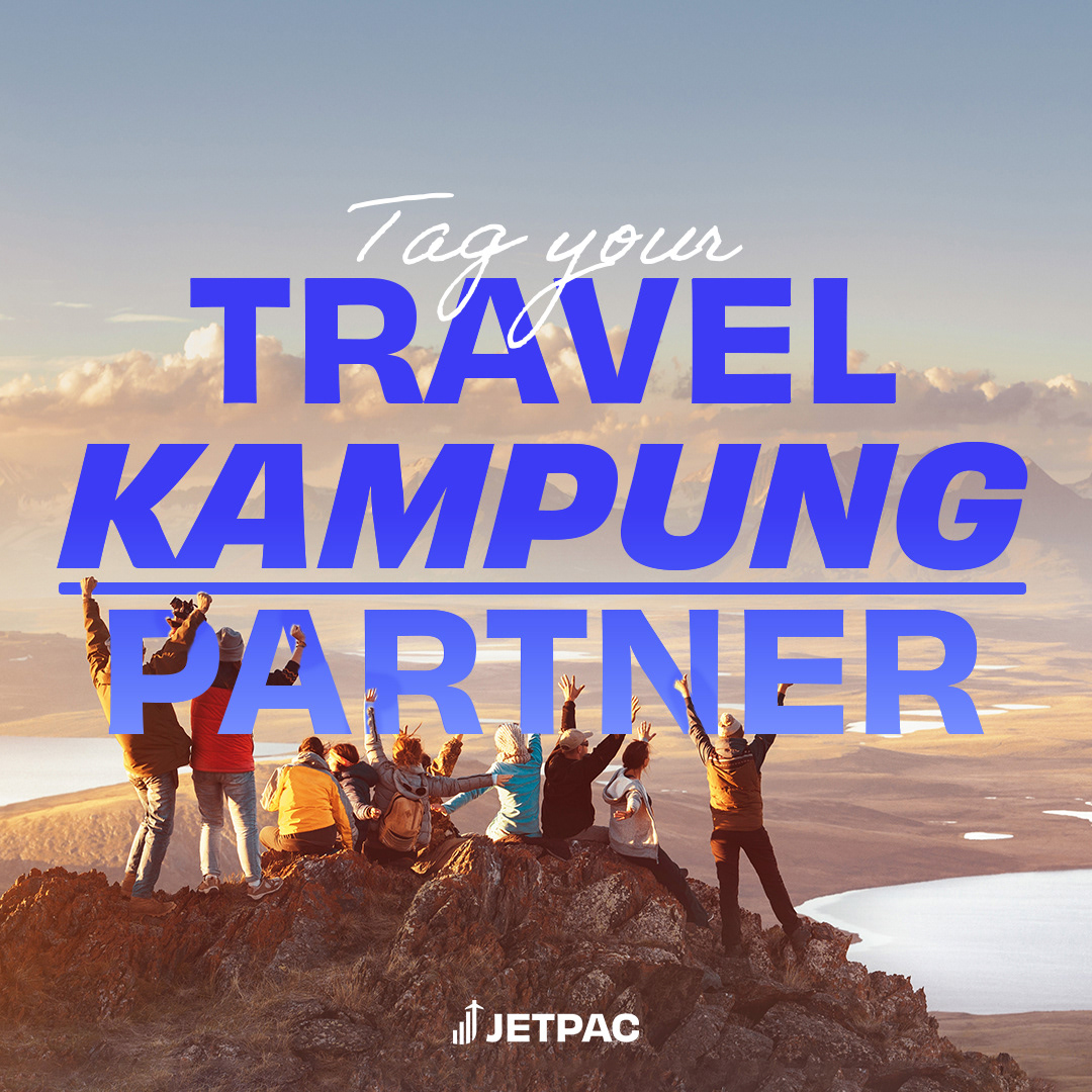
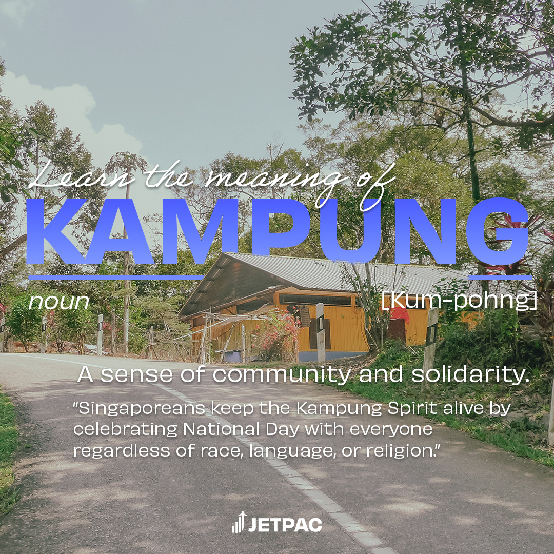
Created engaging and informative visual assets to accompany articles Jetpac is featured in to provide a high-level view of our brand and USPs to travelers.
Revamped design, highlighting the awards won,
Social Media Statics
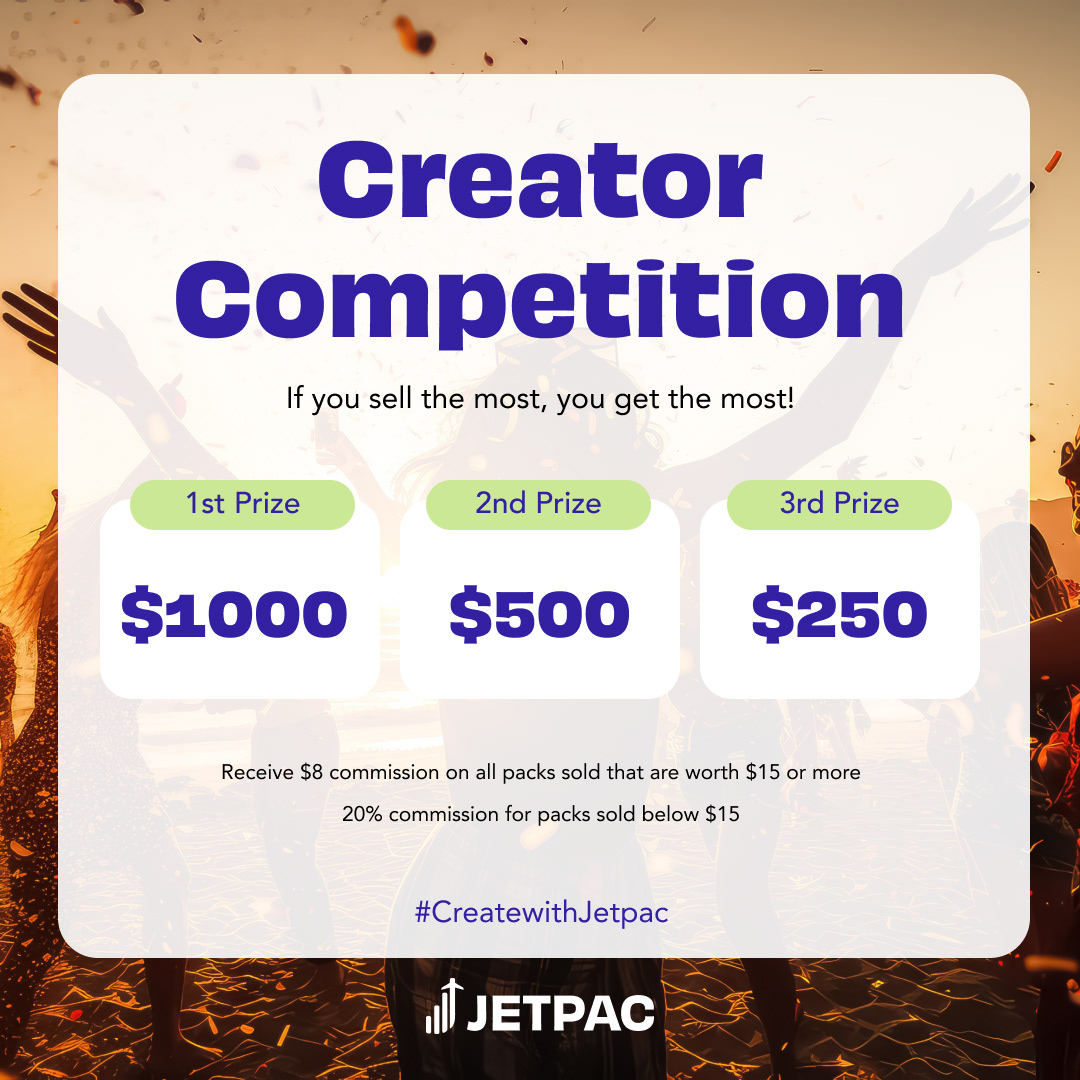
Supported the team in creating giveaway posts, campaign assets, and new programs.

506 likes, 793 comments

592 likes, 622 comments
Social Media Animations
I introduced and animated videos promoting the newest deals based on the campaign that would then be released on our social media channels such as Instagram and TikTok to further engage people and increase awareness.
11.11 Campaign
12.12 Campaign
Times Square Feature
These animations would also be displayed in Out of Home campaigns to raise awareness of Jetpac's newest campaigns, deals, and features to the US market. With Times Square receiving approximately 330,000 visitors per day, showcasing our designs at a global scale allows us to reach new audiences.
12.12 Campaign in Times Square
Out-of-Home Activations
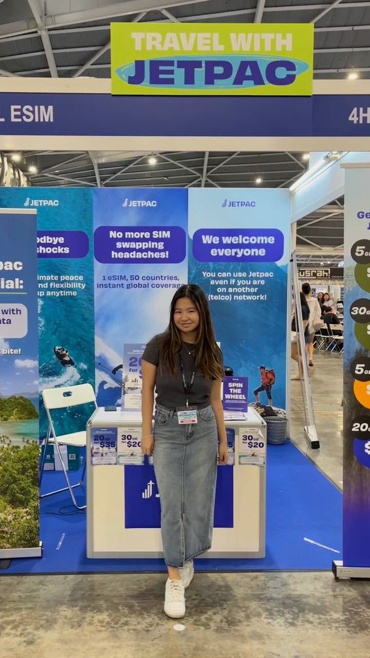
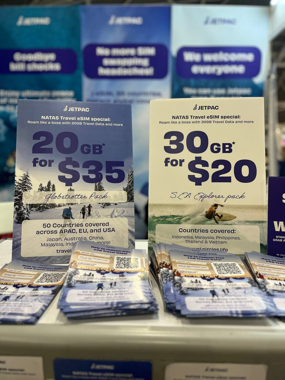
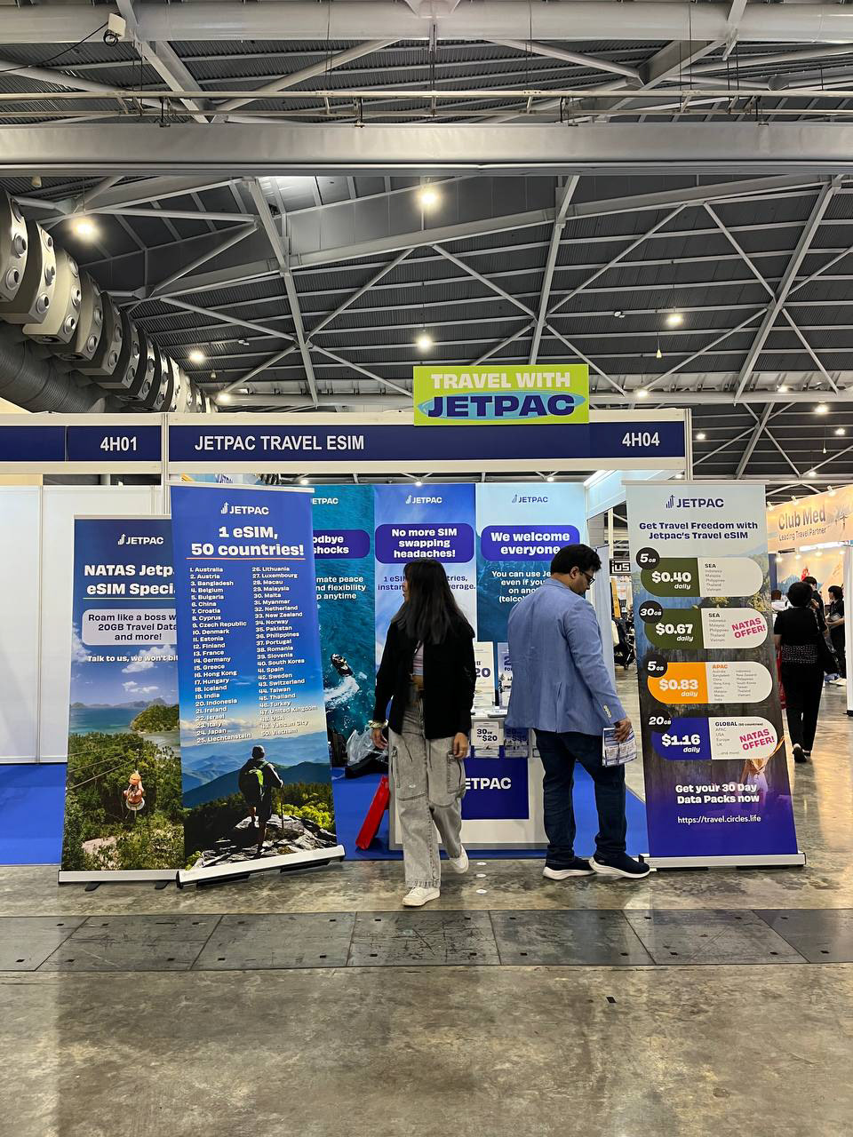
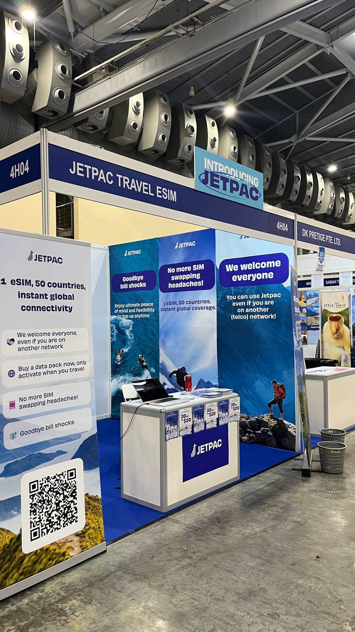
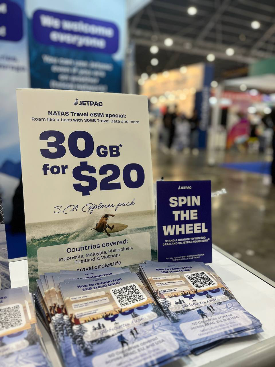
I spearheaded the creation of visual assets from standees, banners, flyers, business cards, foam boards, and clothing merchandise for the National Association of Travel Agents Singapore (NATAS) 2023.
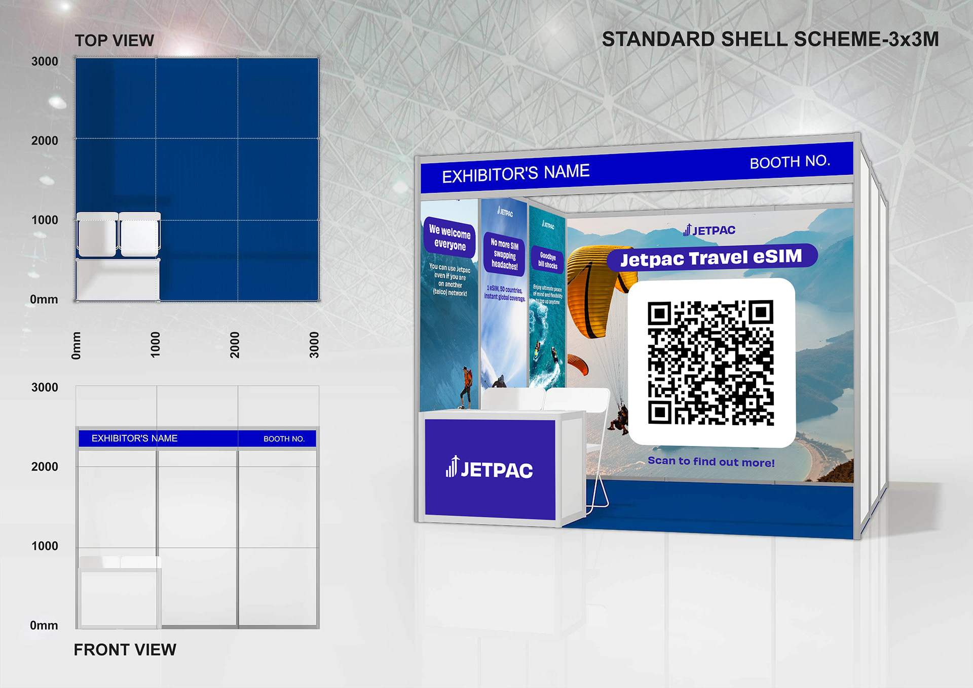
Booth Mockup Design