
Introduction
Jetpac is a travel eSIM that offers one-time data packs for travelers worldwide. The company aims to resolve people’s sh*tty roaming problems and replace them with travel freedom through their easy-to-use packs. Travel like a boss without having to worry about connectivity or bill shocks.
A multitude of data packs, amount of data, and price calls for a new page to cater to all these needs. The product detail page aims to resolve these issues and allow travelers to easily browse through our variety - similar to an e-commerce shop! See the website here.
⎯⎯⎯⎯⎯
Timeline: January 2024
Role: UI/UX Designer (Contractor)
Marketing and Content Lead: Pearlyn Yeo
Product Designer: Asyraf Rasid
Created and developed in-house at Circles
My role
Sketching
Wireframing
Screen Flows
Visual Design
Interaction Design
Journey Mapping
Tools
Figma
Platforms
Android, iOS
Problem
Initially, Jetpac didn't have a lot of products in their portfolio which prevented the need to create a specific page as that would add friction in the user's journey. However, as the company expanded by adding more variations and flexibility for the customer. For example, the same region would sell different amounts of data and, therefore priced differently. While the abundance of choices is good, it would get overwhelming and increasingly complex for users to discover and learn about all the packs on offer.
Previous packs showcase design on the landing page
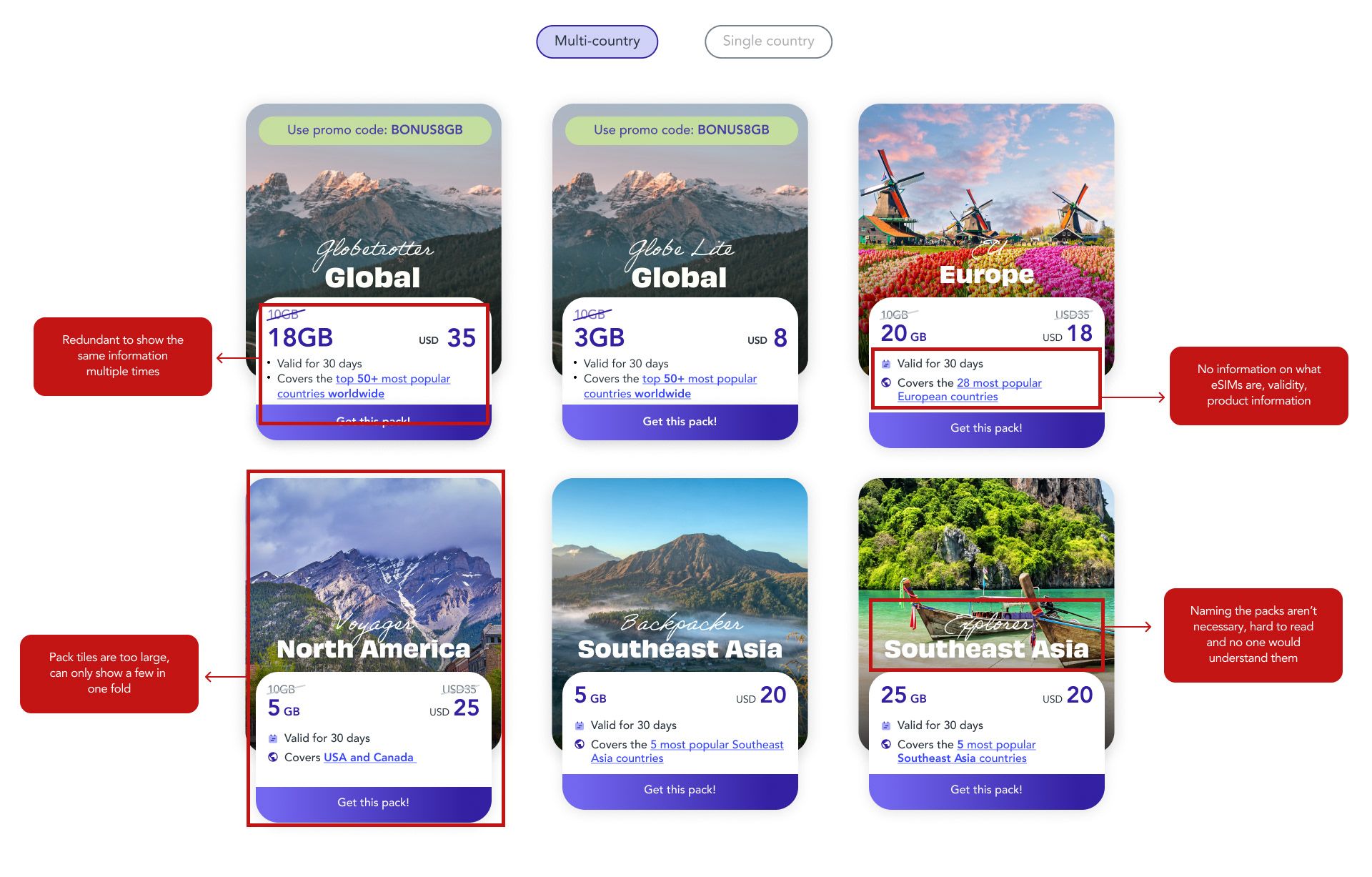
Annotated version highlighting all the pain points
Competitors
Many popular eSIMs, namely Holafly, Airalo, and Nomad have a product detail page that exists in the marketplace. These pages have an outdated design and UX flaws - that contribute to a better experience and that's what inspired me to create this new page!
Some specific issues with GetNomad's were:
• Shows too much information at first glance which becomes overwhelming for a first-time user.
• Unclear what you are purchasing when scrolling down
• Poor information hierarchy
• Difficulty reading the different subheaders, which seems unnecessary when the page is so short
• Main image isn't prompting users to travel
• Dark mode is a bit difficult to read, no option to change to light mode
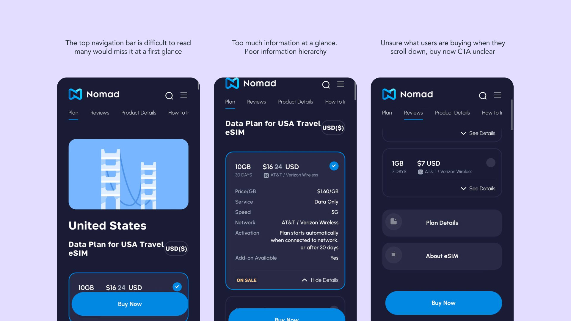
GetNomad's Product Detail Page Analysis
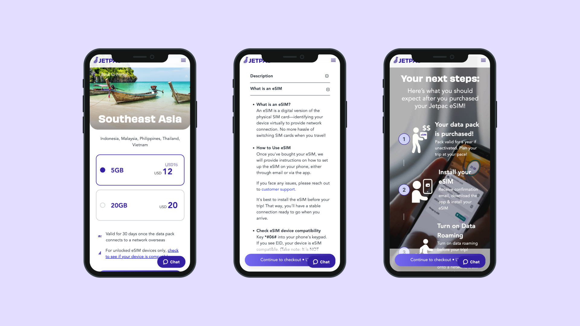
Jetpac mainly has mobile users, so for this project, I prioritized working on mobile. Even though I did both, desktop designs came secondary.
So let’s get to work!
⎯⎯⎯⎯⎯
Scope
How might I support individuals with decision fatigue that would lead them down the funnel to purchase Jetpac?
Design Direction
After looking at our competitors and product portfolio, creating a specific product detail page surfaced to bridge the gap between our landing and checkout page.
Moodboard & Design
Going online and finding inspirational work from other great designers is also really key. Pinterest and Mobbin are my go-to websites. After gathering a few designs similar to the design I aim for, I create a mood board which I use along the way to inspire myself in case I get stuck.
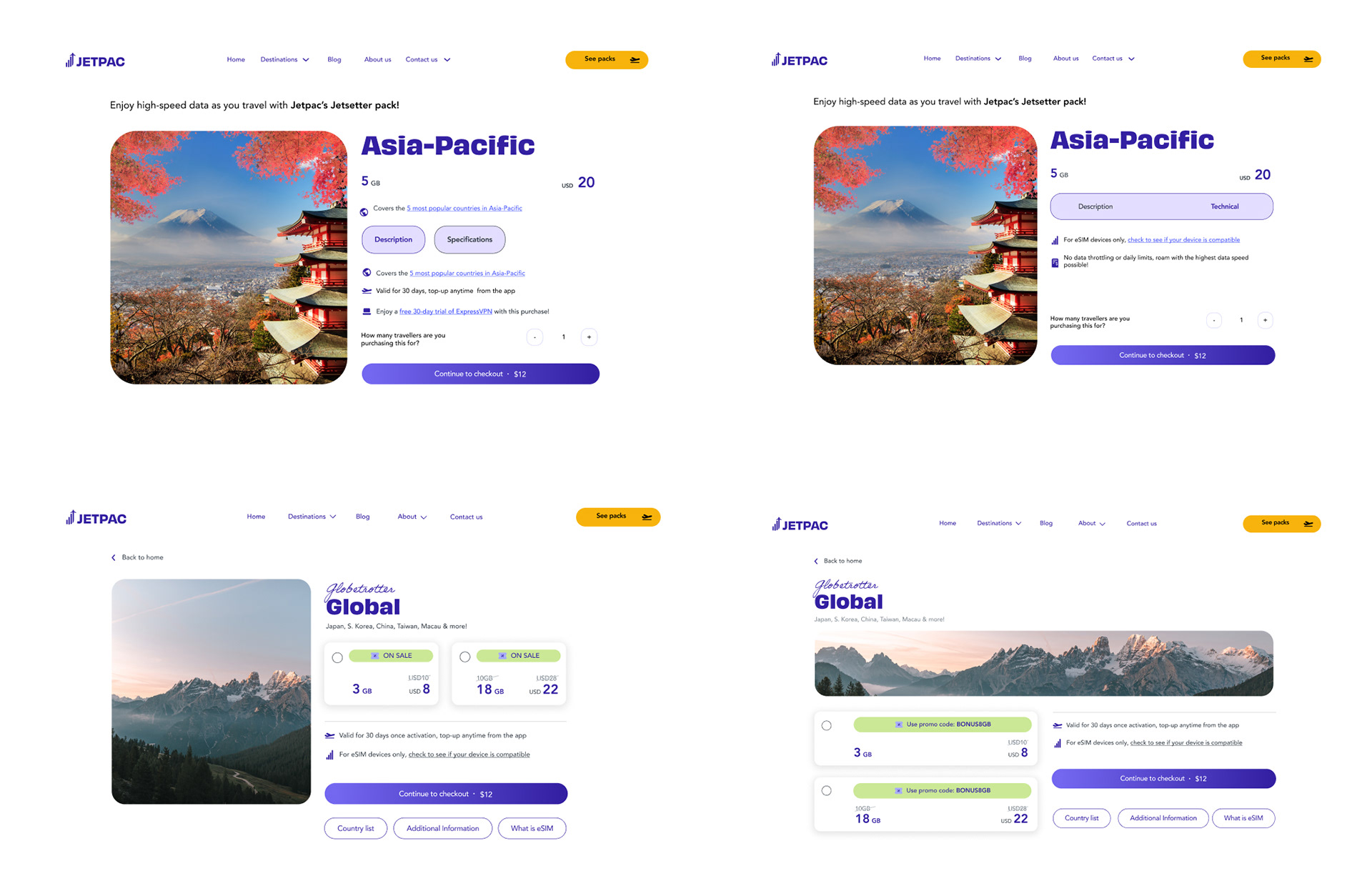
I focused on highlighting the image, amount of data, and price first which are the most important. Other informational content such as validity, eSIM information, activation, and country and networks would also be available. Having a clear CTA of "buy now" is quintessential to prompt users to purchase.
Wireframing
Ideation was done around displaying all the key information as it's a key feature to support users down the funnel. I created initial low-fidelity prototypes of how to show the product details.
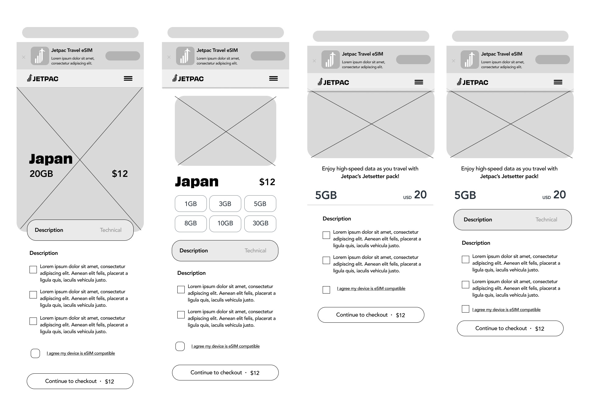
Initial Wireframes
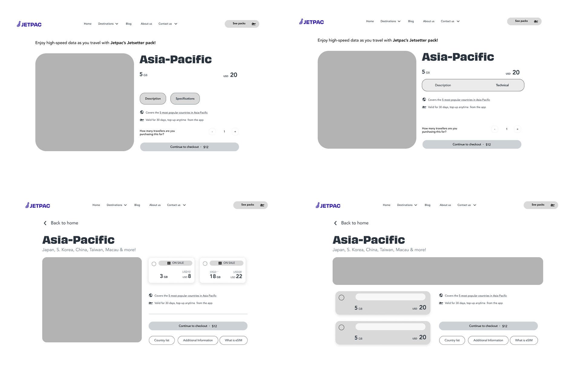
Low to High Fidelity
I converted these into high-fidelity prototypes to better visualize how they would look with color.